Breaking Boxes – Typography and Augmented Reality
The medium of Mixed/Augmented Reality gives us a unique opportunity to reexamine typography’s relation to both us and our space. Historically, boxes and grids have dictated how we design type and employ typography, but how does this hold up when type has environmental awareness?
Adapted from a talk given by Andrew Johnson at Dynamic Font Day 2018 in Munich, Germany.
Hello!
A little while ago I decided to take a Chinese painting class with some friends.
After the instructor showed us some of the beautiful things he had painted, he told us that we were going to be painting birds.
First, he gave us small drops of concentrated ink we mixed with water. It took some time to try and get the ratios of ink to water right.
After that, the instructor gives us some rice paper.
We’re finally ready to paint, so we put our brush down, and this happens:
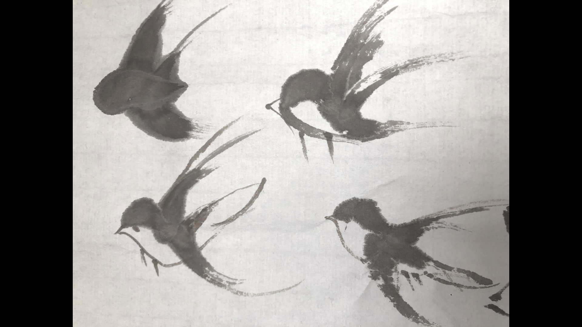
We get something that looks nothing like a bird.
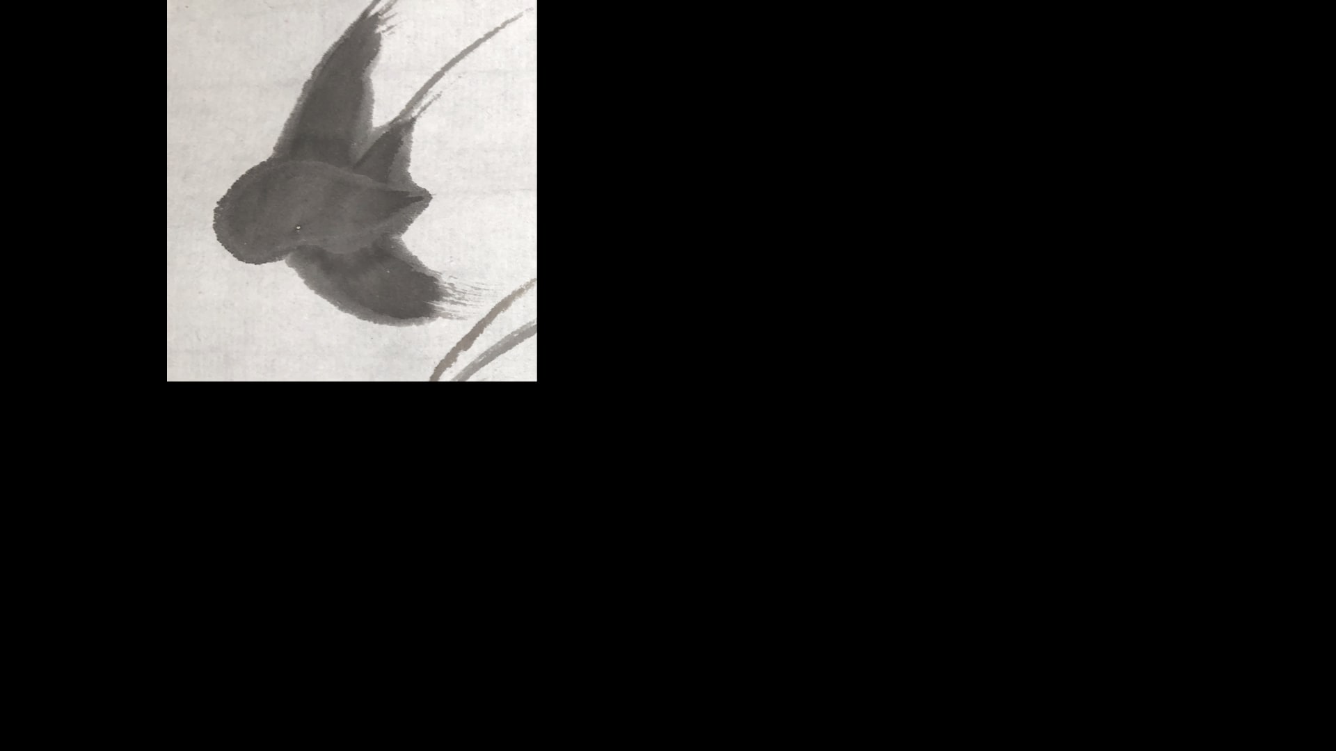
With enough practice, we eventually got closer to something that resembled a bird, although it was far from good.
We’re all familiar with the feeling of trying a new medium. Maybe that’s physical properties of a material like paper or wood:
But it’s also the tools and code we use create things:
The methods and processes around typography have adapted to different technological constraints throughout history.
In his article What Is Code, Writer and Technologist Paul Ford has this quote:
“The turn-of-last-century British artist William Morris once said you can’t have art without resistance in the materials. The computer and its multifarious peripherals are the materials…”
In AR, all these sensors, inputs and cameras are computer peripherals. They’re part of the medium.
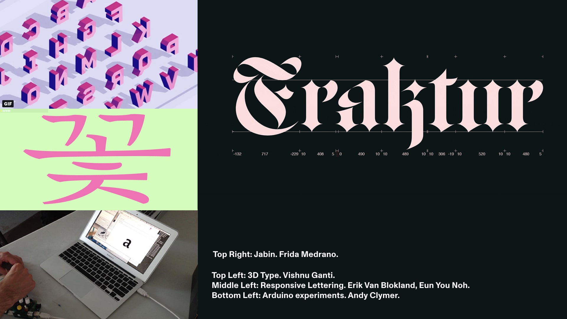
There’s been more experiments than I have time to mention, but some recent ones have been Vishnu Ganti’s 3D type, Variable Fonts like Frida Medrano’s Jabin variable font, Andy Clymer’s Arduino sensor experiments, and Erik Van Blokland’s responsive lettering project and work by students like Eun You Noh.
Realtime 3D is another medium that affects our typography and design. What implications are there for typography? Does this change how we need to design?
Similar to the process of learning how to paint the bird, I did a bunch of AR typography experiments to better get a better understanding of things.
A few years ago, I wrote a sister article to Nick Sherman’s article on variable fonts.
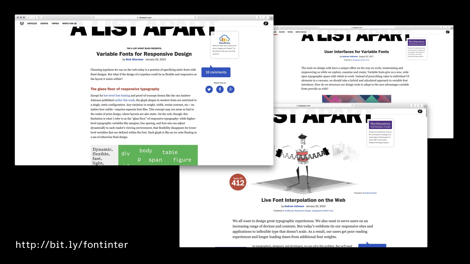
The article showed a proof of concept of a variable font on the web.
Sometime after writing it though, I still wanted to find other use cases for variable fonts. Were there other problems they could solve?
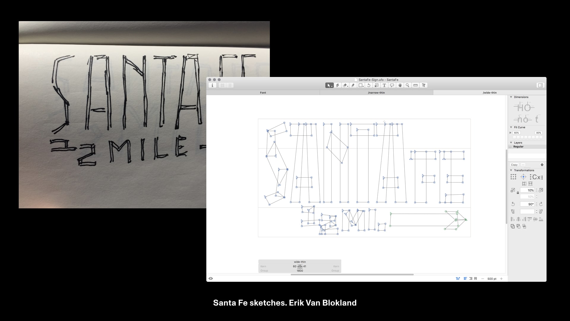
While working with Erik Van Blokland, I realized in AR we have easy access to the readers position relative to the text.
At first, I thought we could manipulate 3D points just like standard fonts:
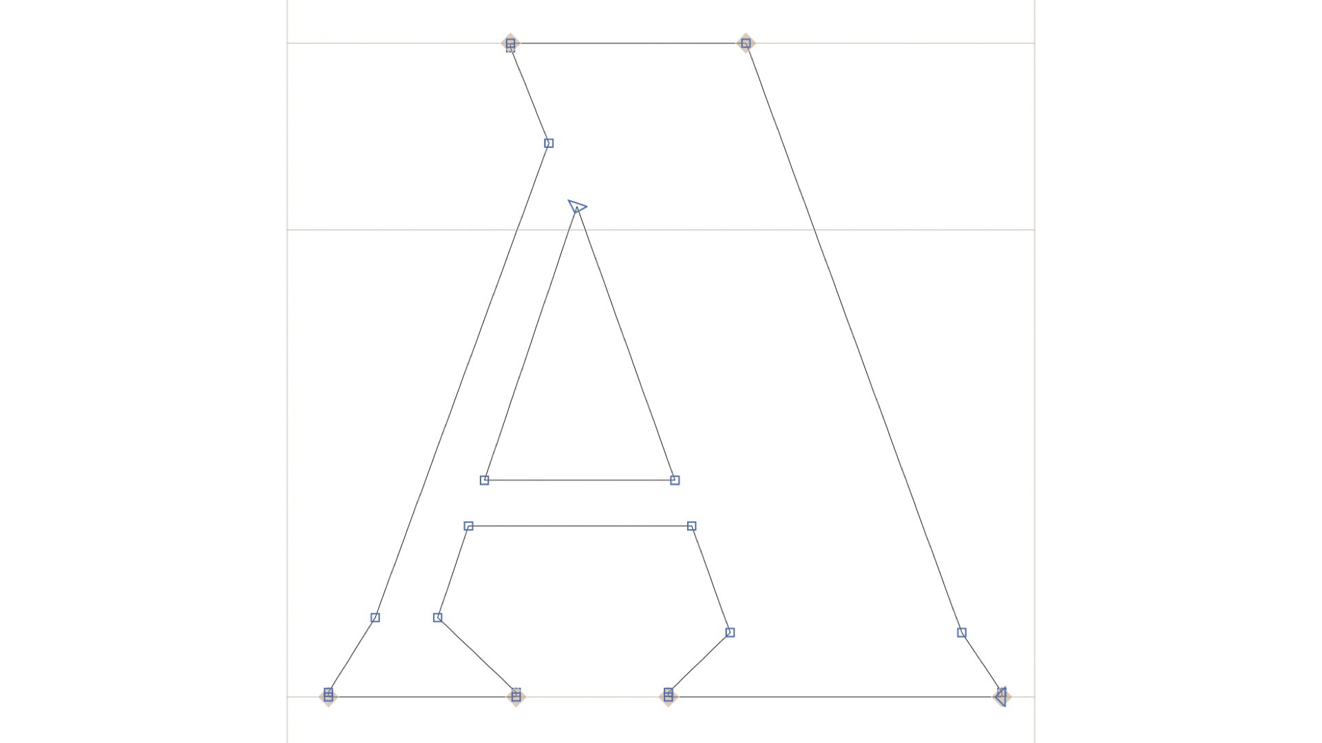
However, it’s more complicated than that. For real time 3D rendering, meshes need to be converted to triangles at some stage.
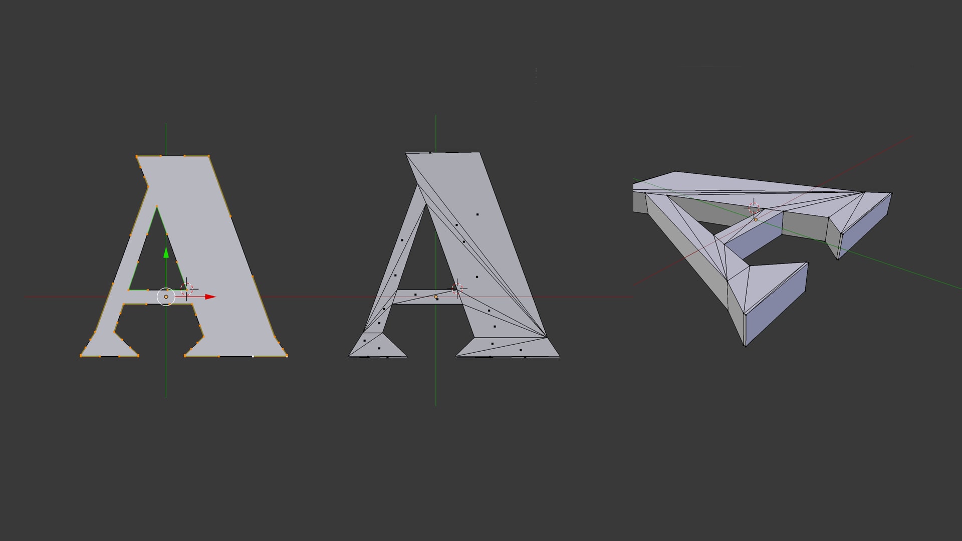
After realizing this I came back to Erik with some unrealistic constraints. To keep the mesh more manageable for interpolation we needed the letters to be made only of individual four sided polygons.
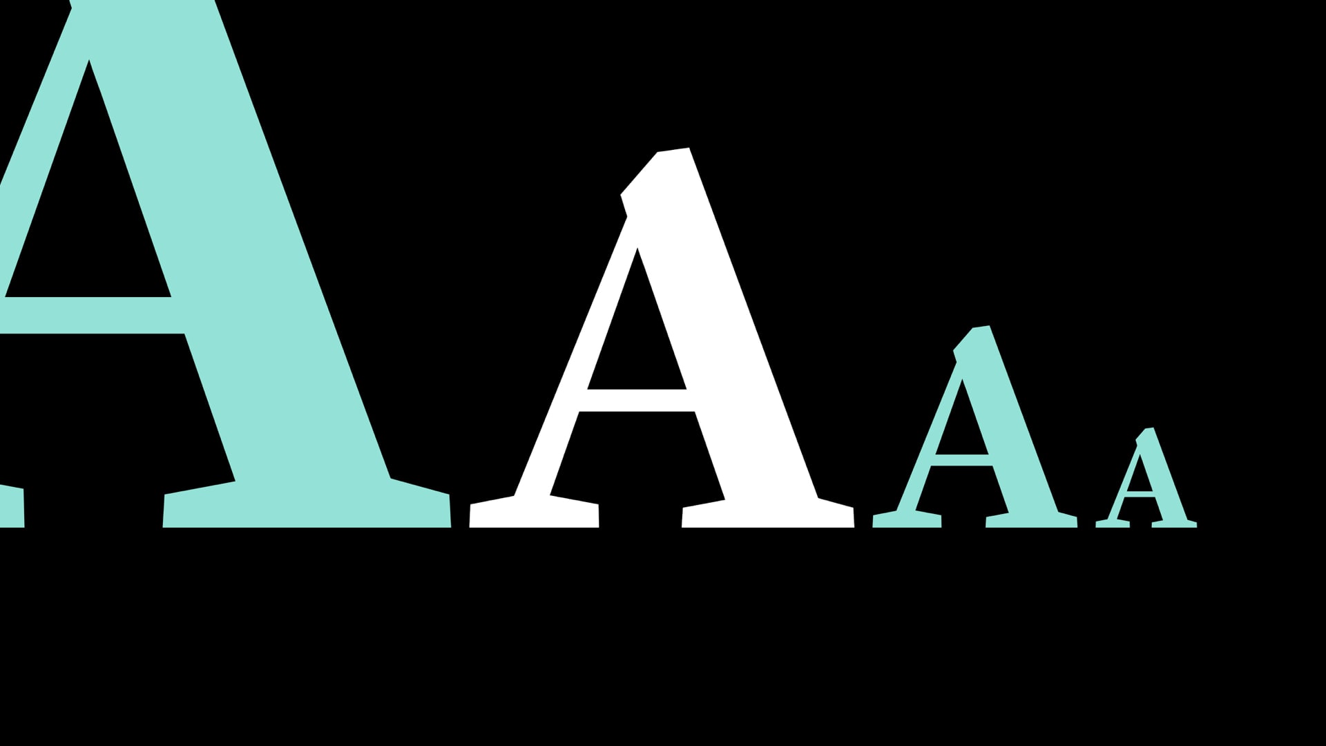
We were able put everything together and generate typography that changed based on distance.
This is interesting because it means visual hierarchy can shift based on distance.
This led to more collaborations, including an AR type specimen with CJ Dunn for his unreleased typeface Louvette.
We wanted to showcase Louvette’s optical axis (it’s serifs) based on a person’s distance to it.
Within Unity we tried both standard text components and signed distance fields.
In order to simulate variable fonts, we loaded a set of discreet font files and revealed/hid them based on distance.
Unfortunately, at certain optical sizes the hairlines would disappear on SDF versions of Louvette. Because of this, we decided to go back to normal text components.
We still broke things a lot! This is what happens when you change the font but forget to change the font material – you can see the font atlas showing through:
We were still able to make a type specimen with a built in optical axis. The hairlines got thinner as you approached and thicker as you moved backwards in order to stay visible.
What’s interesting here is that we can make subtle optical adjustments based on distance. A font’s representation can be tied the user’s place in space.
Placing letters and numbers in 3D space isn’t something new. Emmanuelle Moureaux’s Forest of Numbers used randomly positioned layers of numbers that expressed the year 2017.
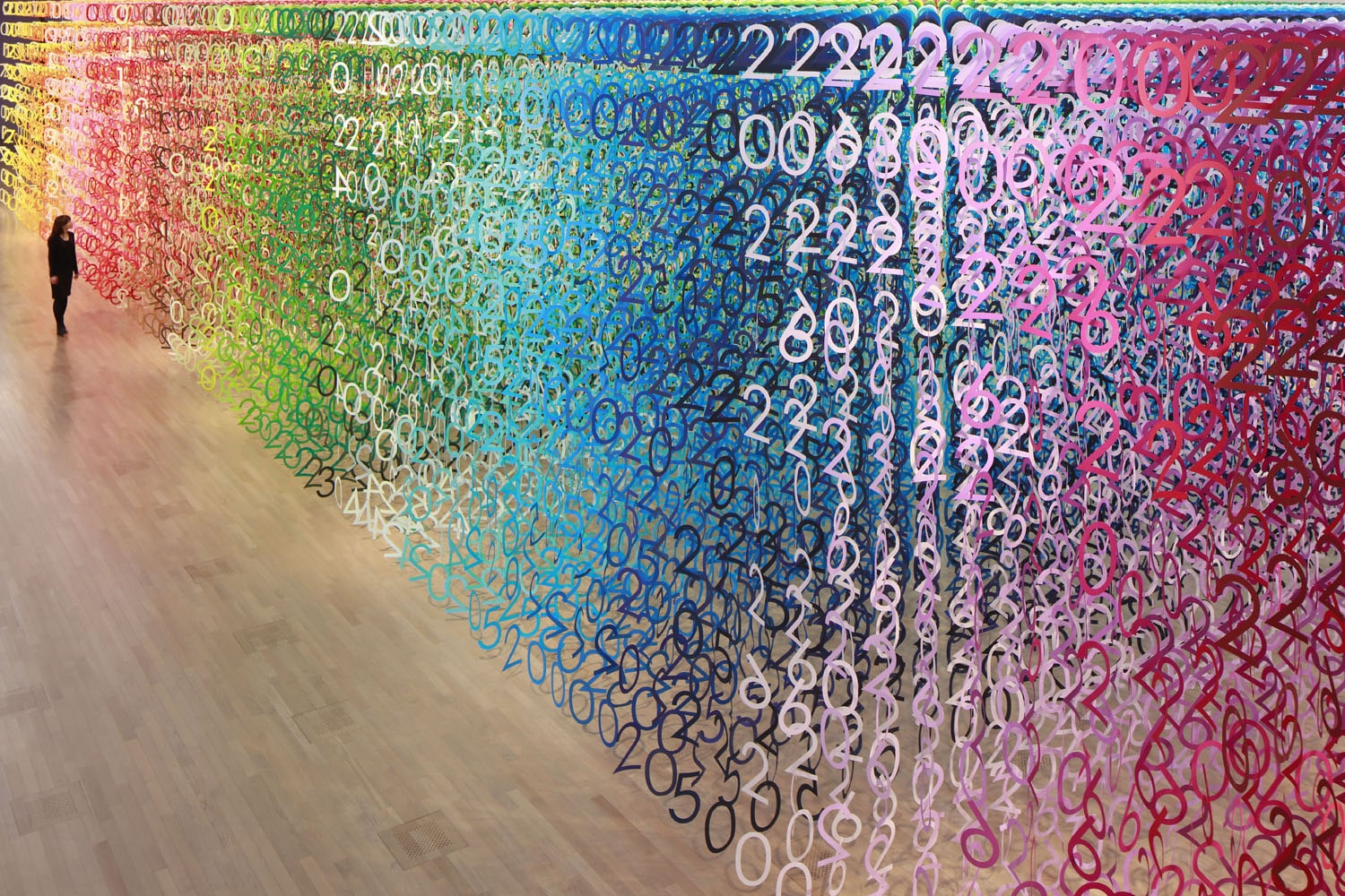
I started collaborating with David Jonathan Ross and experimenting with ideas inspired by Forest of Numbers.
One of the first outputs was a 3D array with numbers color gradients based off of their distance to the user.
Trial and error led us to simplify things.
David suggested making the numbers bigger instead as you got closer.
This gave us a more engaging effect in AR by giving people a single thing to focus on.
From there, we were able to place the number panel in world space.
It turned out to have a pretty neat cascading effect.
But the key thing here is that content itself can change based on a person’s proximity to an object, not just its style.
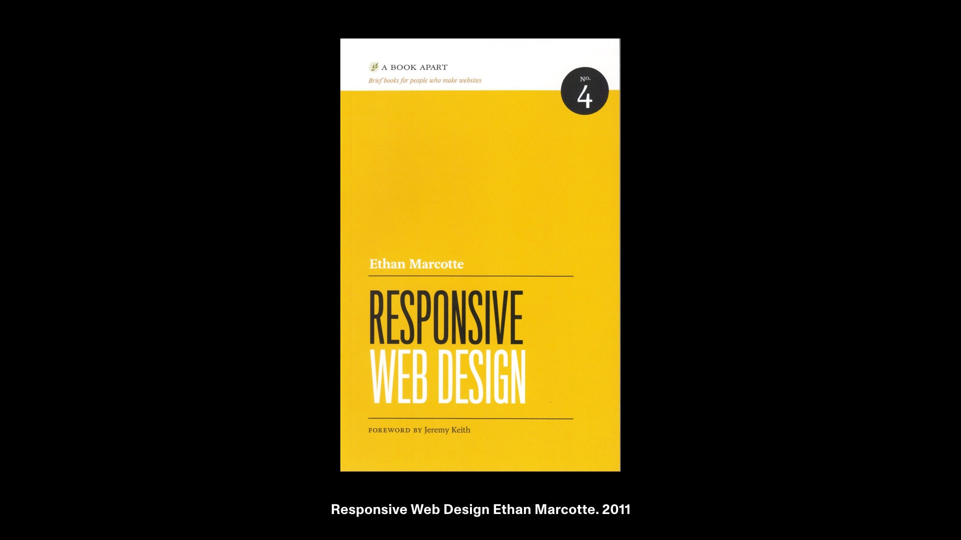
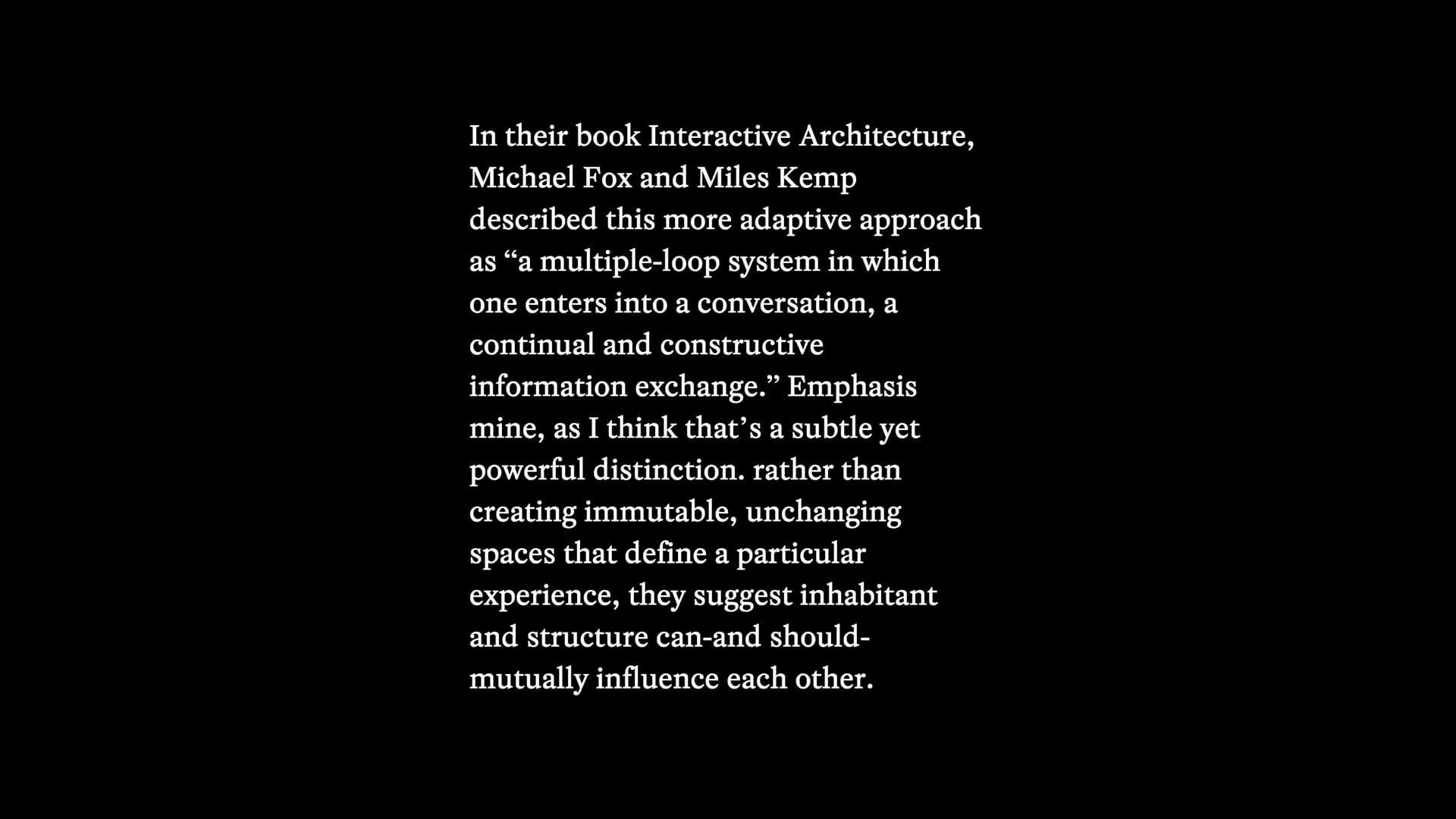
In 2011, Ethan Marcotte wrote the book Responsive Web Design. It outlined ways our media should adapt to different conditions.
One of Ethan’s references was responsive architecture. Generalizing, Responsive Architecture falls into two main categories:
- A building’s ability to meet the changing needs of its inhabitants
- A building’s ability to adapt to outside climate conditions
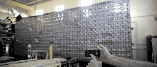
The Aegis hyposurface built in 2001 by dECOi responded to both user and environment. It was a mechanical facade that would deform in response to nearby people’s movement, sound and light.
Similar to the hyposurface, I was able to distort type by moving mesh vertices.
This caused a pretty interesting ripple effect.
This means we can push and pull typography in the Z axis, so text can be volumetric.
To better understand 3D space in AR, it’s important to look at the hardware that enables it:
Mobile devices provide a window to see things and require you to move your arm. They use a combination of the device camera, infrared sensors and accelerometers for AR input.
Headgear is more experimental and comes with a different set of human factors with the wider field of view. The human eye can look comfortably about 60° in any direction and the neck can naturally swivel about 120°.
Headsets also estimate optical focal points through eye-tracking, simulating how our vision blurs as we focus on objects at different distances.
Because they rely on light projection, objects and text in headset experiences are not completely opaque. White makes images more bright, where 100% black shows as transparent. Some headset displays are darkened by default to make up for this.
Knowing this, we can think about how our type reacts to light.
I made light reactive typography that pushed the text color in the opposite direction of the ambient light.
AR typography can appear on any background, so enabling typography to adapt to lighting makes a lot of sense.
This is especially true for environments with constantly shifting lighting conditions like the outdoors.
Bikepaths are a common urban sight, depending on the city.
As common as they are, there’s something fascinating about these!
They’re designed with a user’s distance in mind – they’re skewed in order to be more readable from a certain perspective.
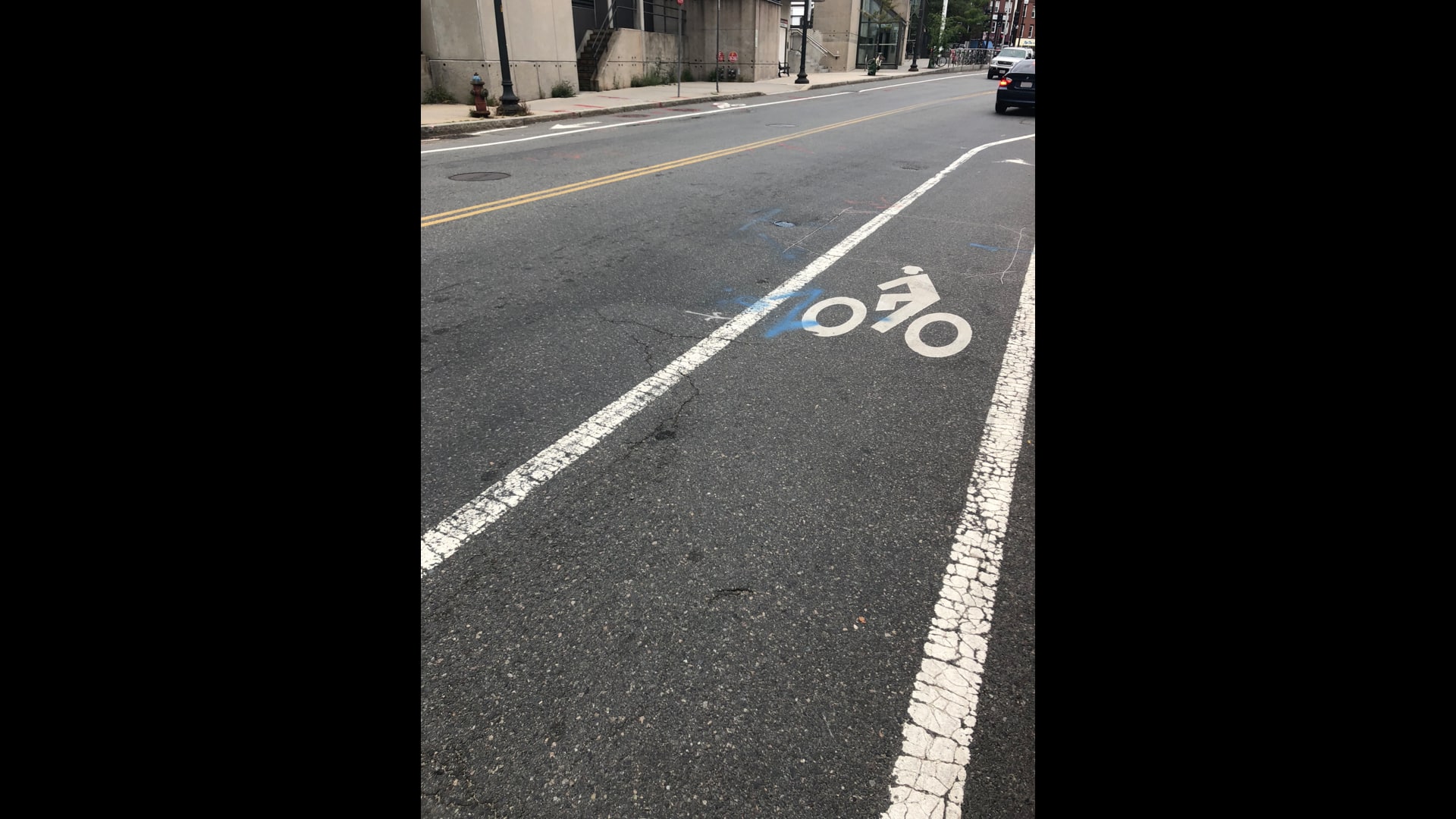
Close up, the same bike path icon’s skew is even more apparent but not as important to convey information from there.
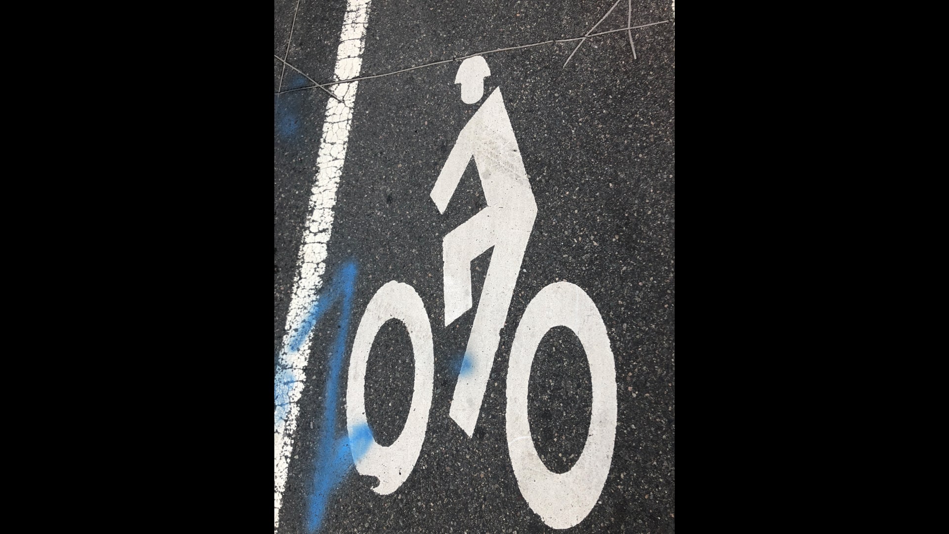
Lane signage allows us to ‘label’ a specific surface instead of relying on a separate sign.
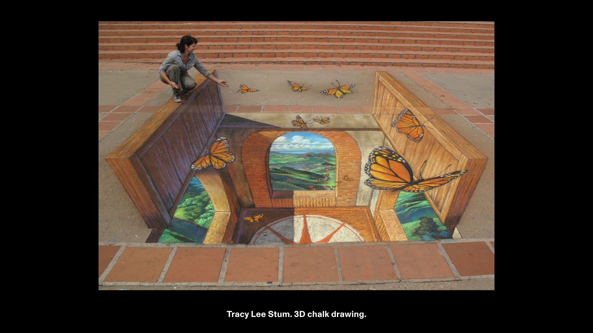
There are many similar examples in art and design.
Perspective chalk drawings by Tracy Lee Stum use perspective to create an illusion of depth.
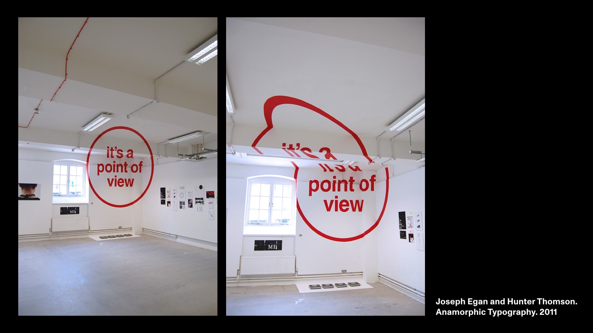
Anamorphic Typography, a project by Joseph Egan and Hunter Thomson is only readable from a certain angle.
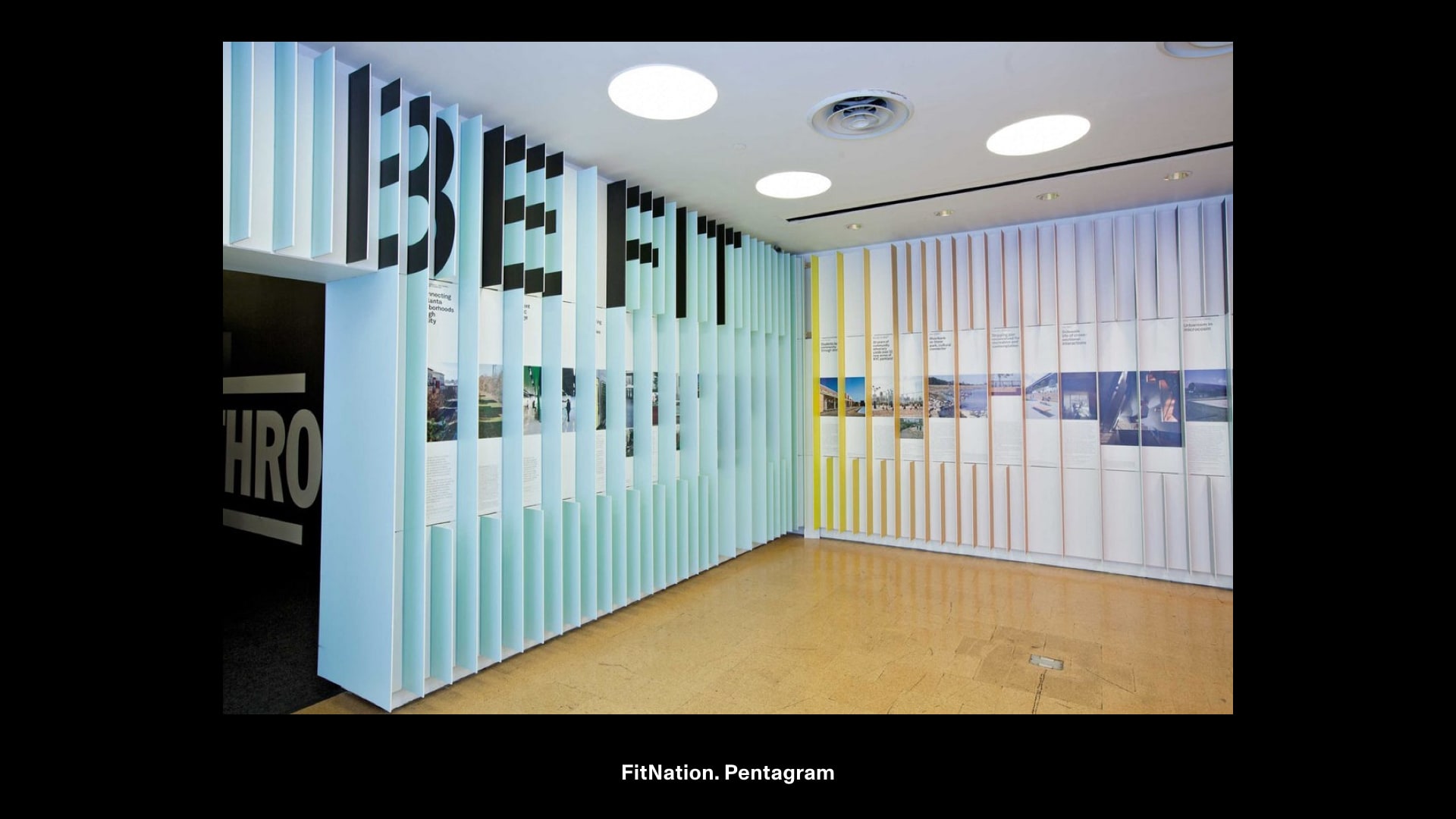
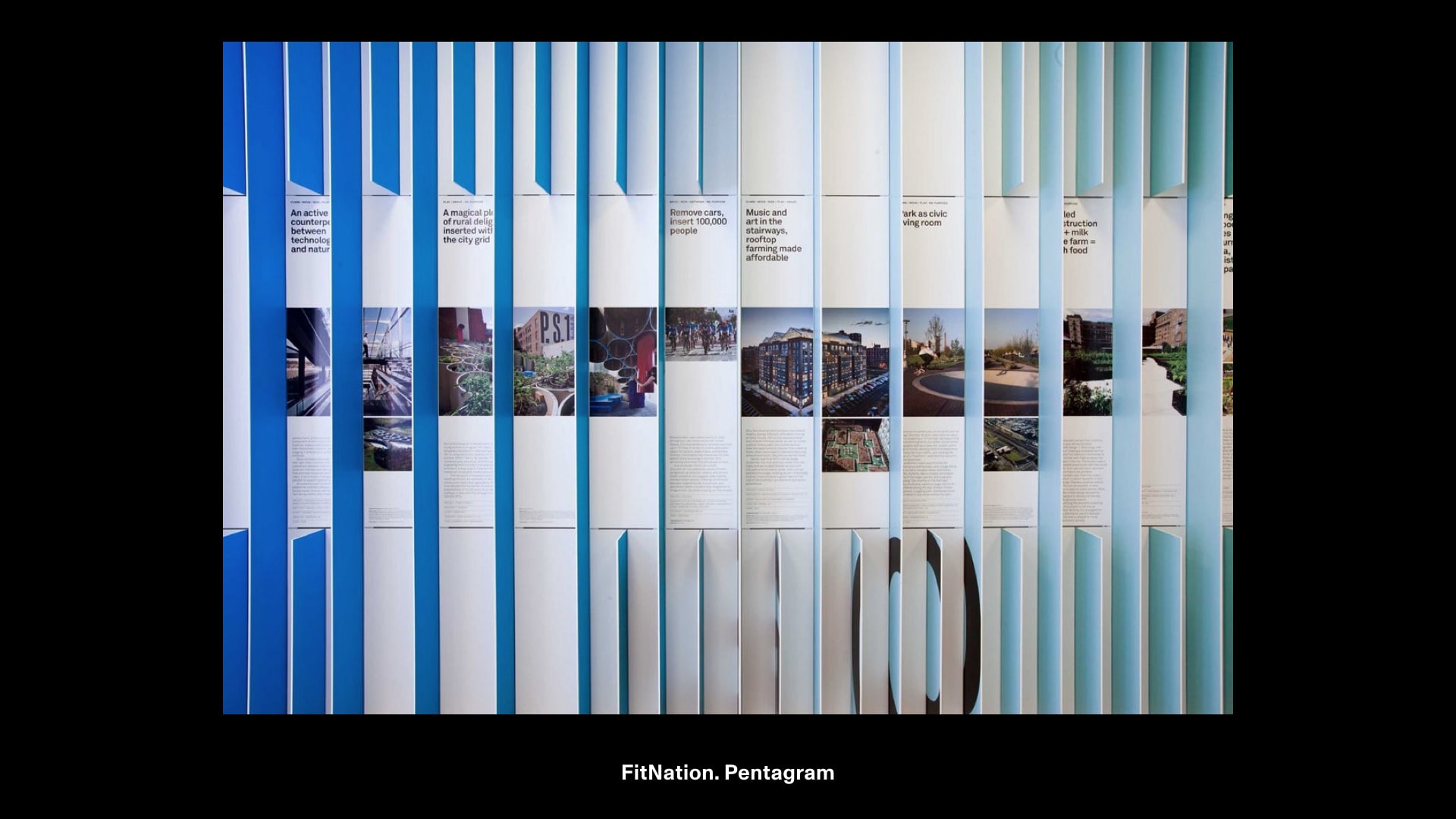
Pentagram’s Fit Nation cleverly encourages you to move throughout the space, supporting the fitness concept.
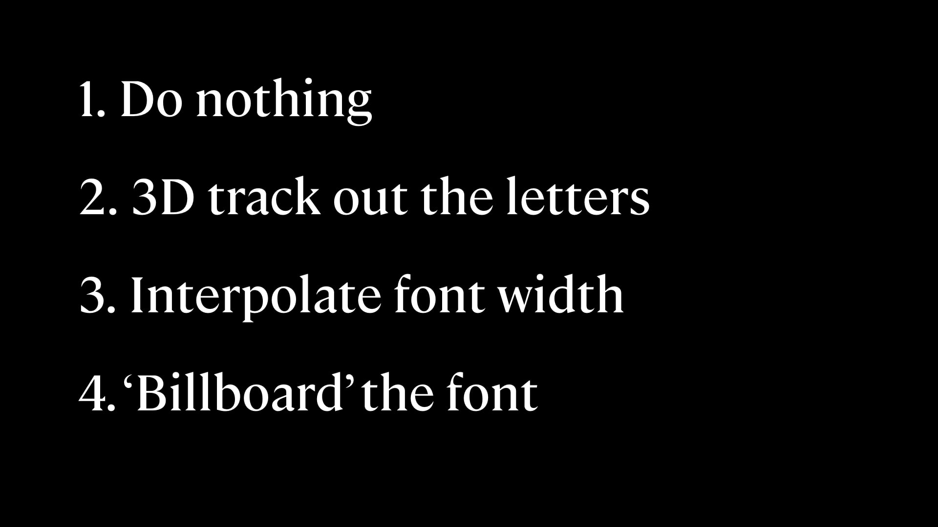
I decided to test some ideas for making type more readable from different angles.
There were a few different approaches to doing this:
I tested different approaches in Unity (and thanks to Bianca Berning was able to use the Variable Font Venn which features an extreme width axis).
Here, you can see how these hold up differently to distance and viewing angle.
Out of these four cases, interpolating width was the most interesting because it allowed the text to stay on the same plane, similar to road signage.
I built adaptive typography adjusts that adjusts to be more readable at wide angles as you walk around it.
For vertical signs the range of motion might look something like this.
I also wanted to try flat items lying on a surface.
Flat surfaces like a table are different from vertically standing ones because you can walk around them. Doing this adds another axis, so I needed both a width and height axes.
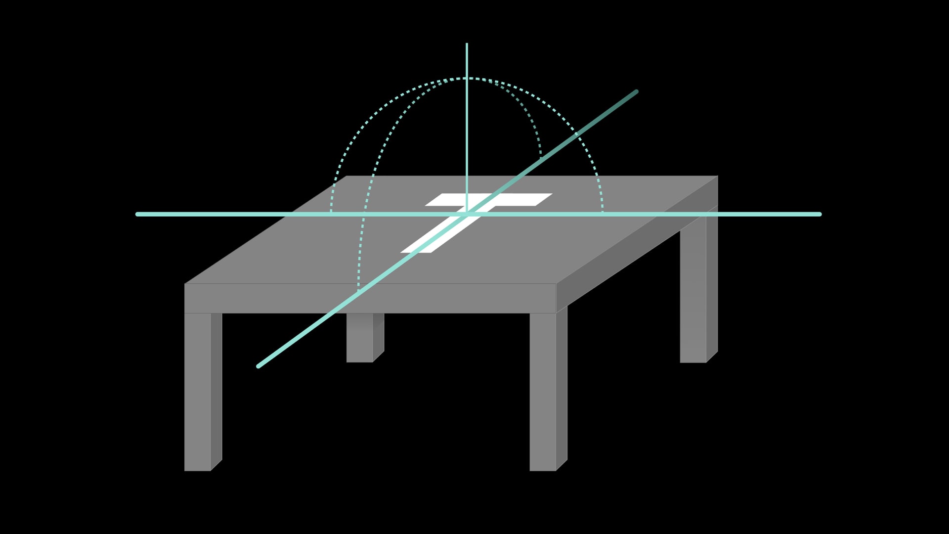
At first I tried to use a combination of width and font size, but this got hard to make equal, proportional changes in each direction.
To remedy that, I designed a font with a proportional width and height. This made it predictable/manageable with how much space it would take up within the interface.
With the font I made a clock that that aimed to be more readable from a number of angles.
Through experimentation, I realized that people would never view something from a complete 90° angle. Setting the max angle to something like 60° felt like a good balance.
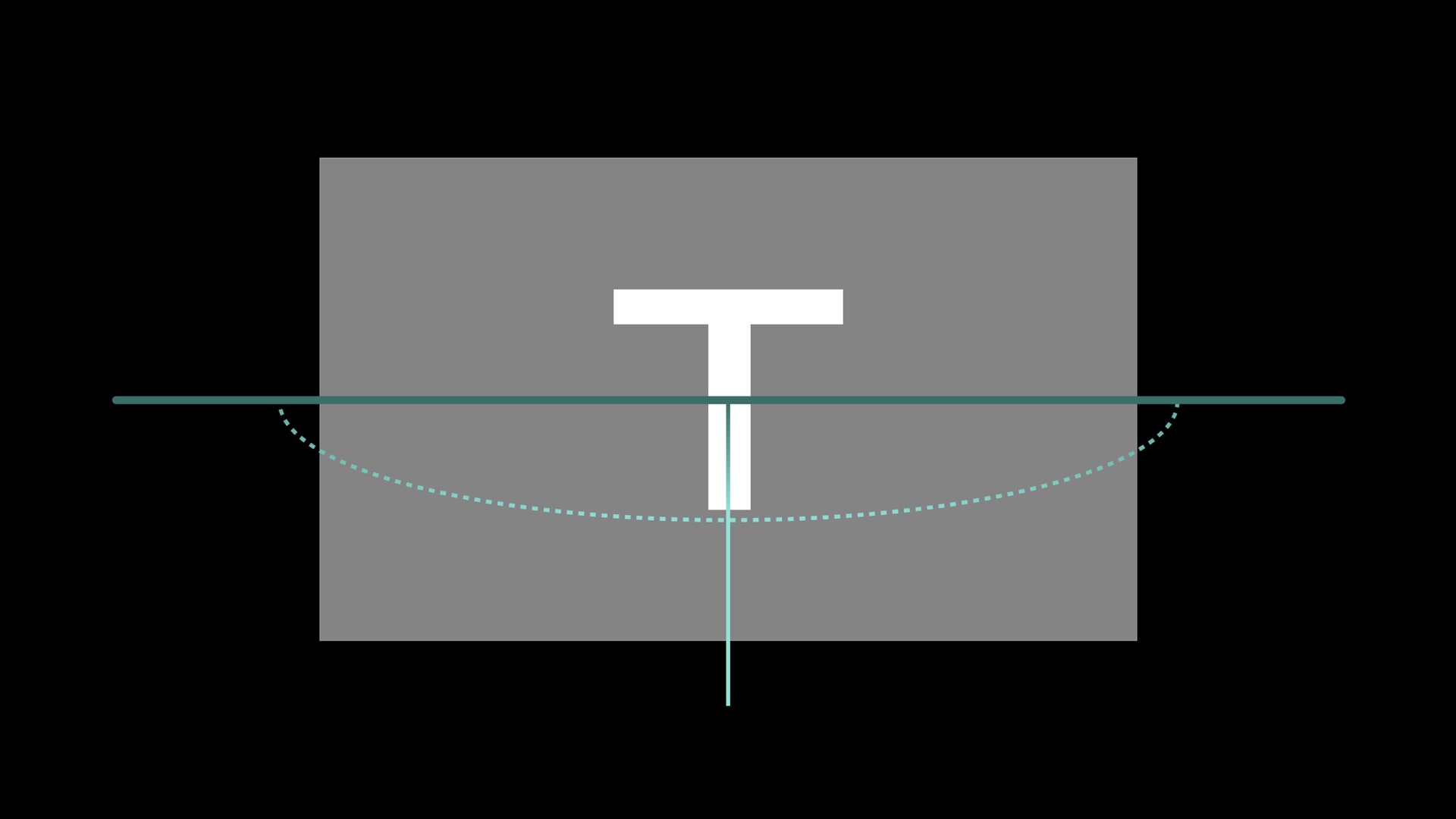
The actual surface area of the text changes. This has some of the most interesting implications for AR type.

Optical AR typography can take up a different amount of space based on your viewing angle!
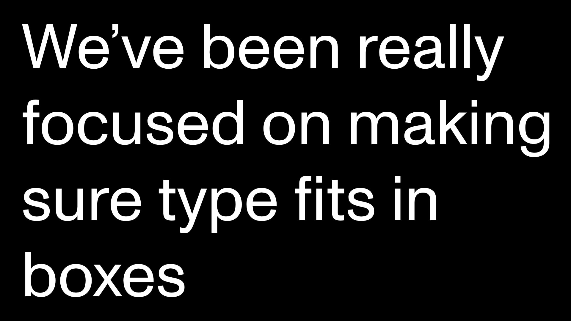
But, we’ve been really focused on making sure type fits in boxes.
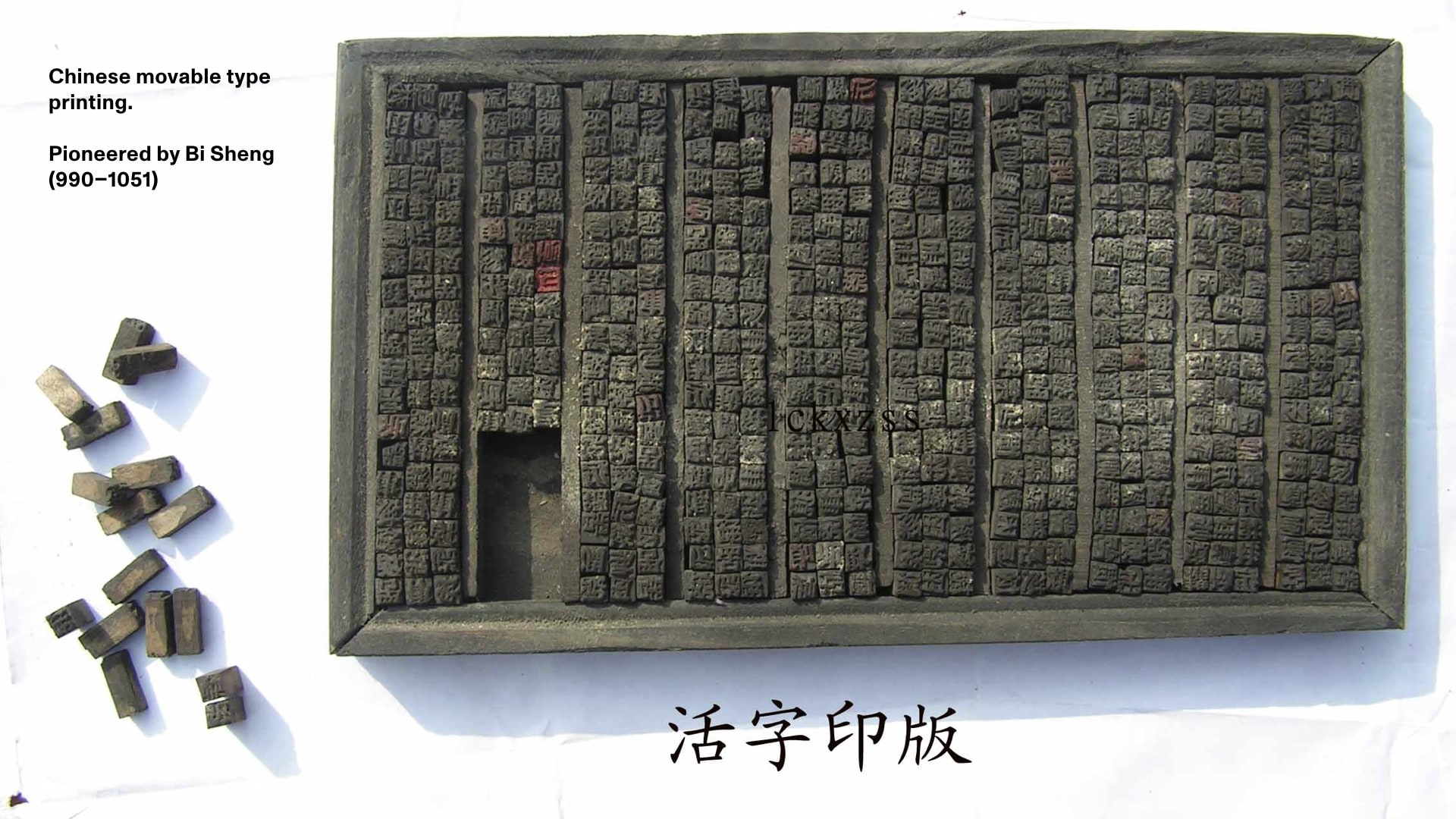
From a long time ago since movable type…
…to the text columns and grids we use to set our type…
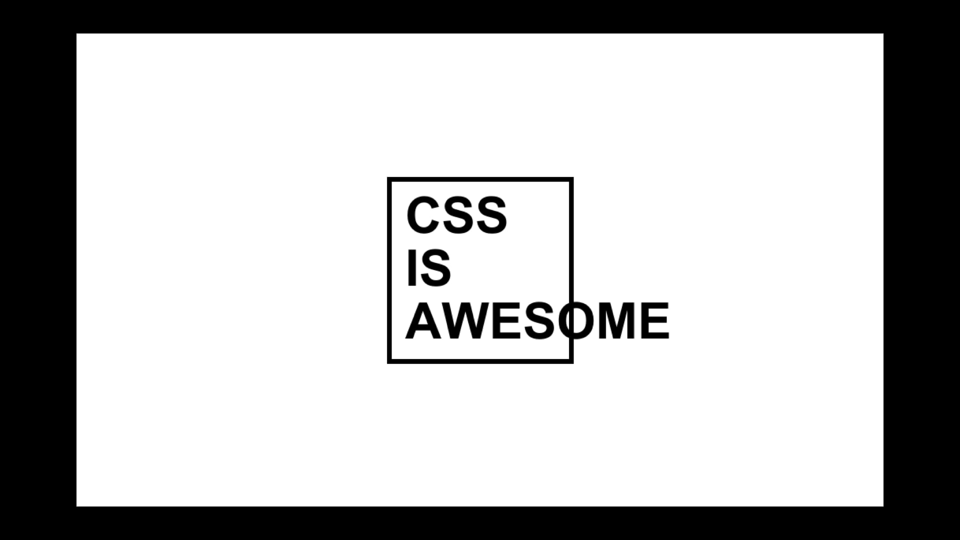
…to the medium of the web. This is the whole box model in CSS.
We know this so well we have jokes about breaking it.
We make flexible containers and grids…
…and things inside them adapt…
…and type that can stretch to fill different amounts space in AR.
And this is really awesome! It’s exciting because of the flexibility it gives us with our design and layouts.

But…
We also have to realize how it constrains how we think…
…and how it influences the types of reading experiences we design.
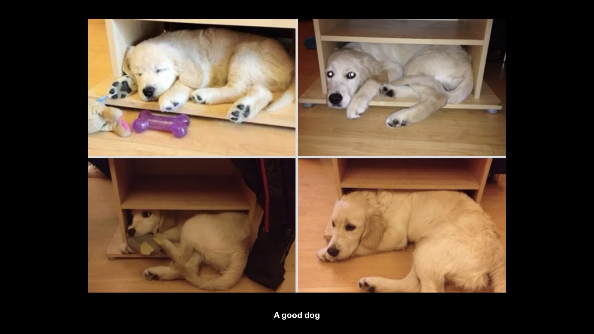
Maybe, like this dog, fonts have outgrown their containers.
Historically we’ve forced type in boxes and grids, but all these experiments we’ve walked through are cases where type is not restricted by its container.
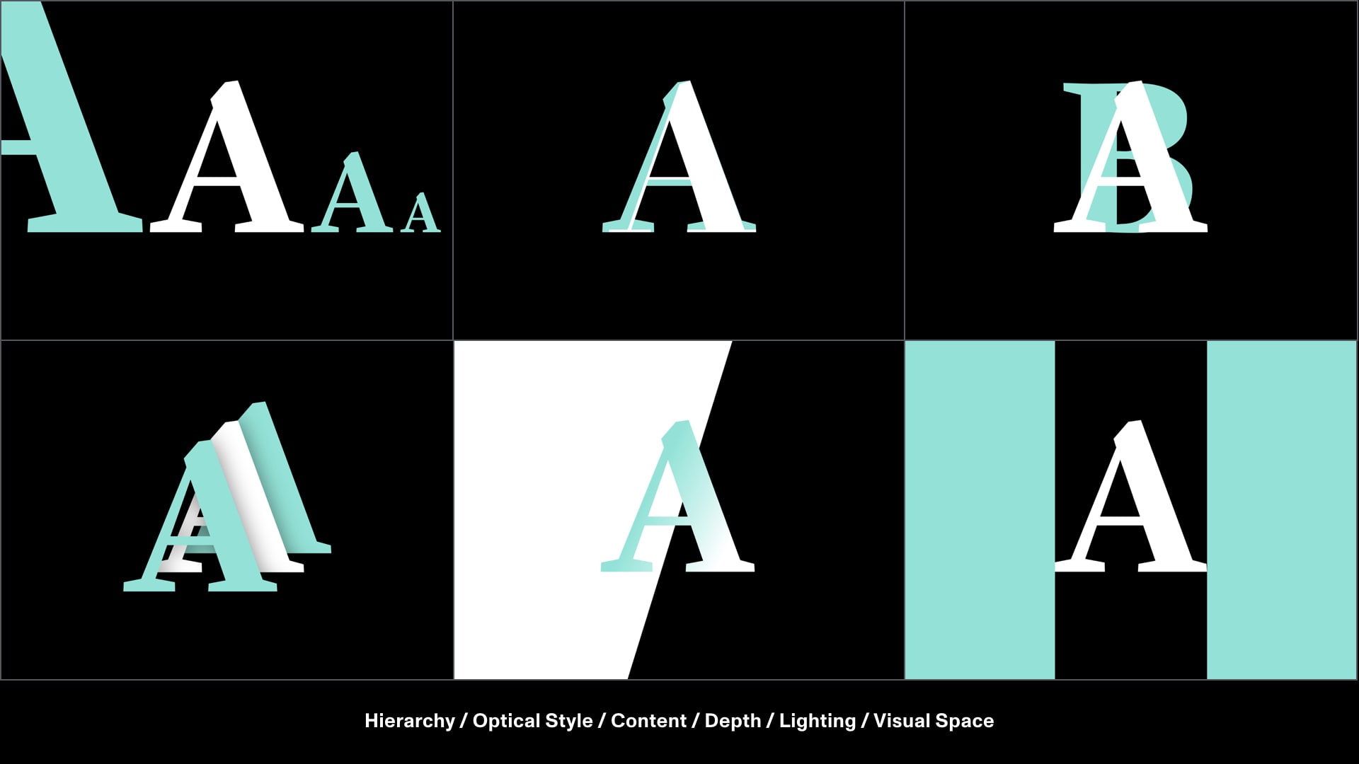
This means the entire space around adaptive type should be open to change.

In this LEGO instruction proof of concept, the bottom panel adapts to fit the optical needs of the typography, instead of the other way around.
So what does our medium look like?

We’re still learning, but in AR, the medium is no longer flat or confined to a box.
Instead, typography can interactively maintain the best possible reading relationship with the viewer.
This means we need to think about our environment, how we exist in our environment and typography’s relation to both of these.
The space that typography exists in has to adapt too.
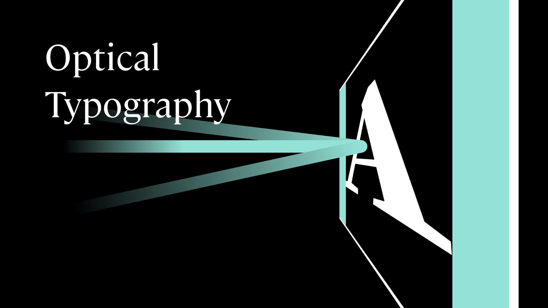
“Instead of being constrained to boxes, AR and sensor-based adaptive typography should be able to influence layout as much as layout influences type.”
And this way, we can create typography that’s more accessible, exciting and thoughtful in AR.
Thank you.
Update: March 12, 2020: There are some considerable parallels with content driven layout in Intrinsic Sizing in CSS.
A writeup of more developments and pragmatic examples can be found in another one of my posts, Approaching Spatially Adaptive Type.
Additional thanks to reviewers who provided critical feedback: Caitlyn Crites, Erik Van Blokland, Jordan Santell and Scott Kellum.
A collection of the videos can be found here.