Approaching Spatially Adaptive Type
Typography and interaction are tied together. How should dynamically adapting type behave? How can we use new interaction patterns to provide more comprehensible reading conditions in responsible ways?
Typography only needs to exist in 3D space for it to become a perceived affordance. Like other objects around us, text gives us clues about where we are positioned in relation to our environment. We understand proximity and perspective through optics (1) and our learned understanding of the world. We experience the world in a stream of information, but perceive it at one point in time from a single perspective. Fortunately memory and intuition help us construct a model of how things normally work. The overlap or disconnect between this and an interface is what makes it intuitive or counter intuitive.
Illusions of Grandeur
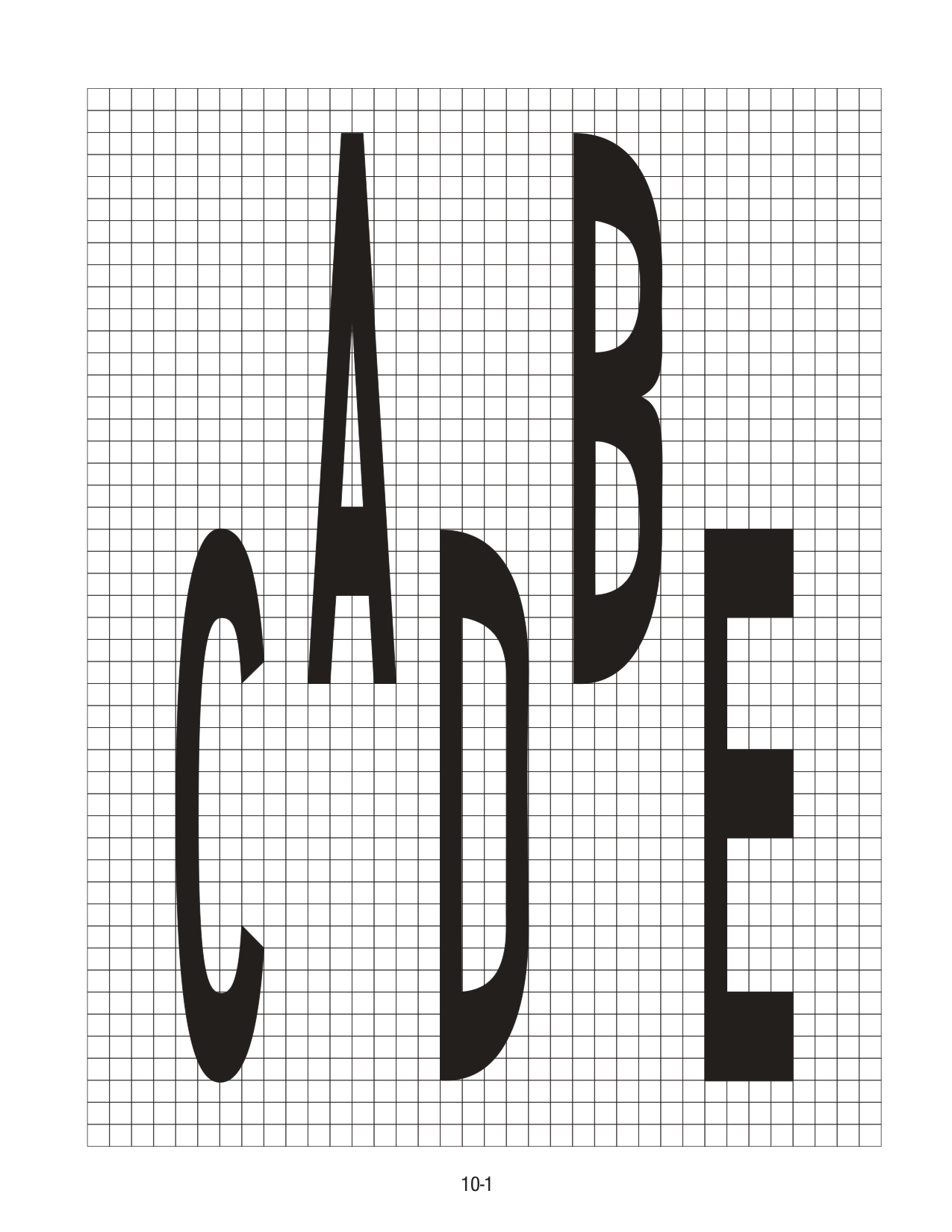
While fonts themselves don’t have an overtly intrinsic behavior, they come packaged with a general set of characteristics. Readers develop an understanding of what their language’s letterforms communicate. The approach in the construction of the Latin ‘I’ can mean the difference between an ‘I’ and an ‘l’ or ‘1’, depending on the style (note the header of this section which doesn’t distinguish between I and l). In kanji, the top stroke direction and type differentiates the ‘千’ character (thousand) from ‘干’ (dry).
千 干
While conventions should be challenged, letterforms generally hold some degree of intentional consistency within a type style so they can easily be read. At the same time, diverging from these conventions is often what brings about engaging types of communication (2).
Typography is language. As a persistent – but not consistent – carrier of information across media, having it show up in spatial computing is not surprising.
Our physical human experiences form the basis of our intuition for how physical things work and behave. Things like gravity and air offer resistance, momentum affects how objects change speed, etc. Mixed Reality exists in a liminal space between our physical / spatial understanding of the world and the navigational / interaction conventions that form as we use digital interfaces.
Here is where we can look at the behavior of typography.
A Different Perspective
Within an XR interface, there are two primary reasons typography might change relative to the view, each with different applications:
1. The person moves around the typography anchored in worldspace
Signage and wayfinding benefit from this, since they facilitate people moving throughout a space.
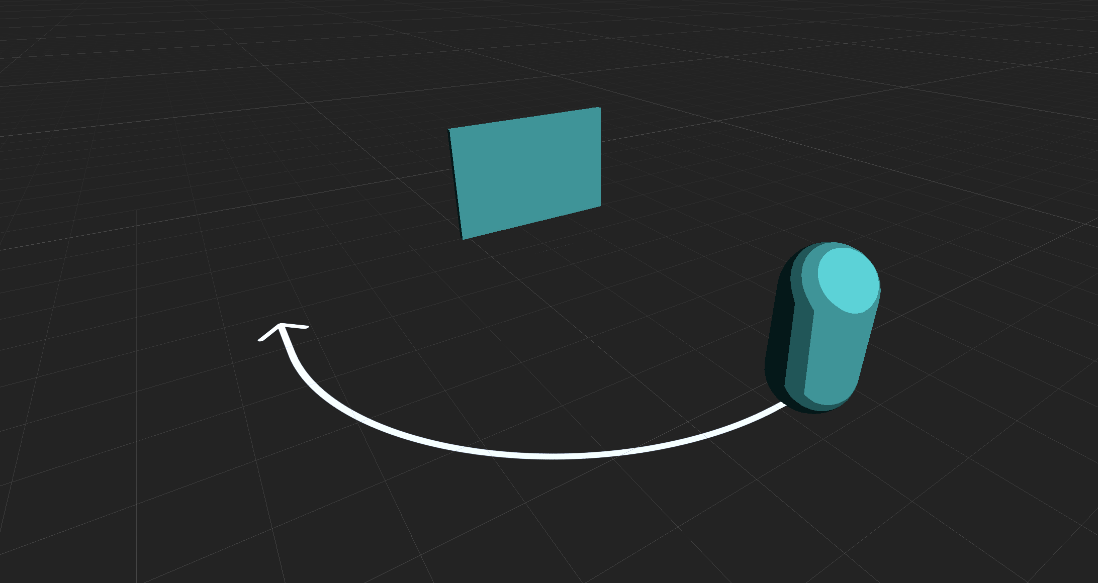
Applications that encourage or facilitate exploration like Google map’s live view, walk-through / support apps, and tabletop games may use static worldspace anchored type.
2. The typography moves around the person, manipulated or by itself
Objects that are manipulated directly in worldspace can take advantage of diegetic labels.
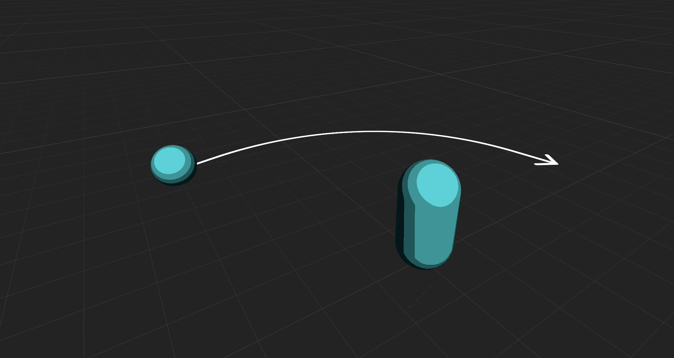
Products like Apple’s Measure App and IKEA Place use labels on objects that are rotated and moved around in worldspace.
In these cases, text is often visible from different perspectives. For example, a taller font on a pathway can be more legible than a short one.
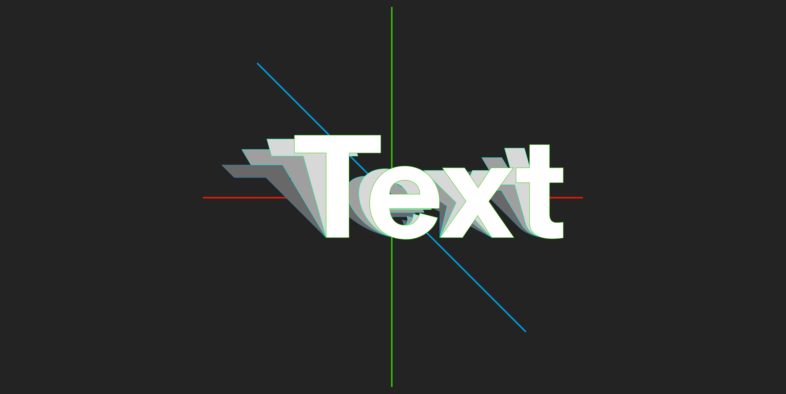
Animation becomes the vehicle for adapting variable fonts seamlessly to their reading environment. We can map a set of common environmental inputs to a particular set of axes. Spatially relevant approaches include, but are not limited to:
Distance → Optical size axis
Designs like Louvette AR
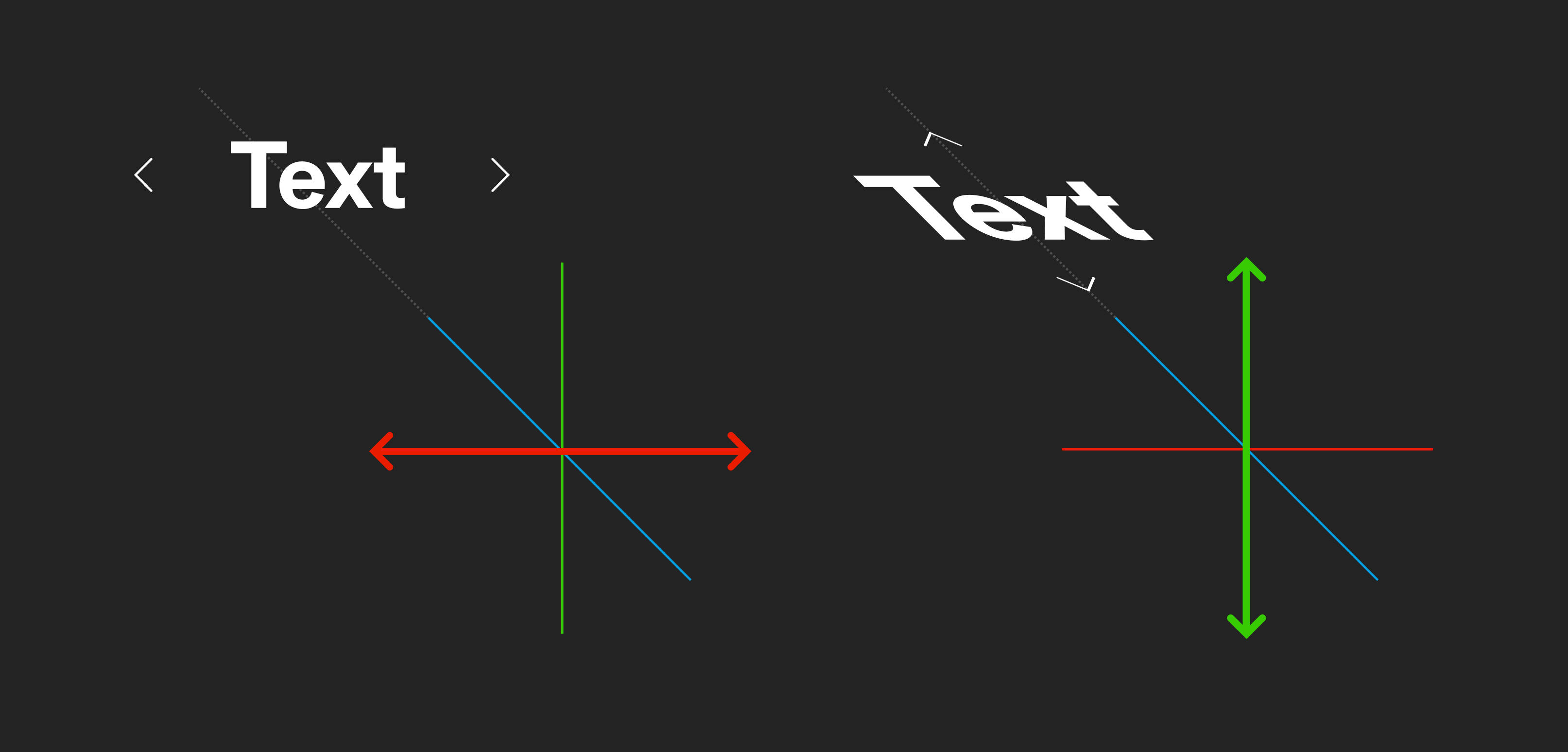
Horizontal viewing angle → Width axis
Designs like Gen Ramirez’s Entorno and AR width experiments
Horizontal viewing angle → Slant axis
AR viewing angle experiments.
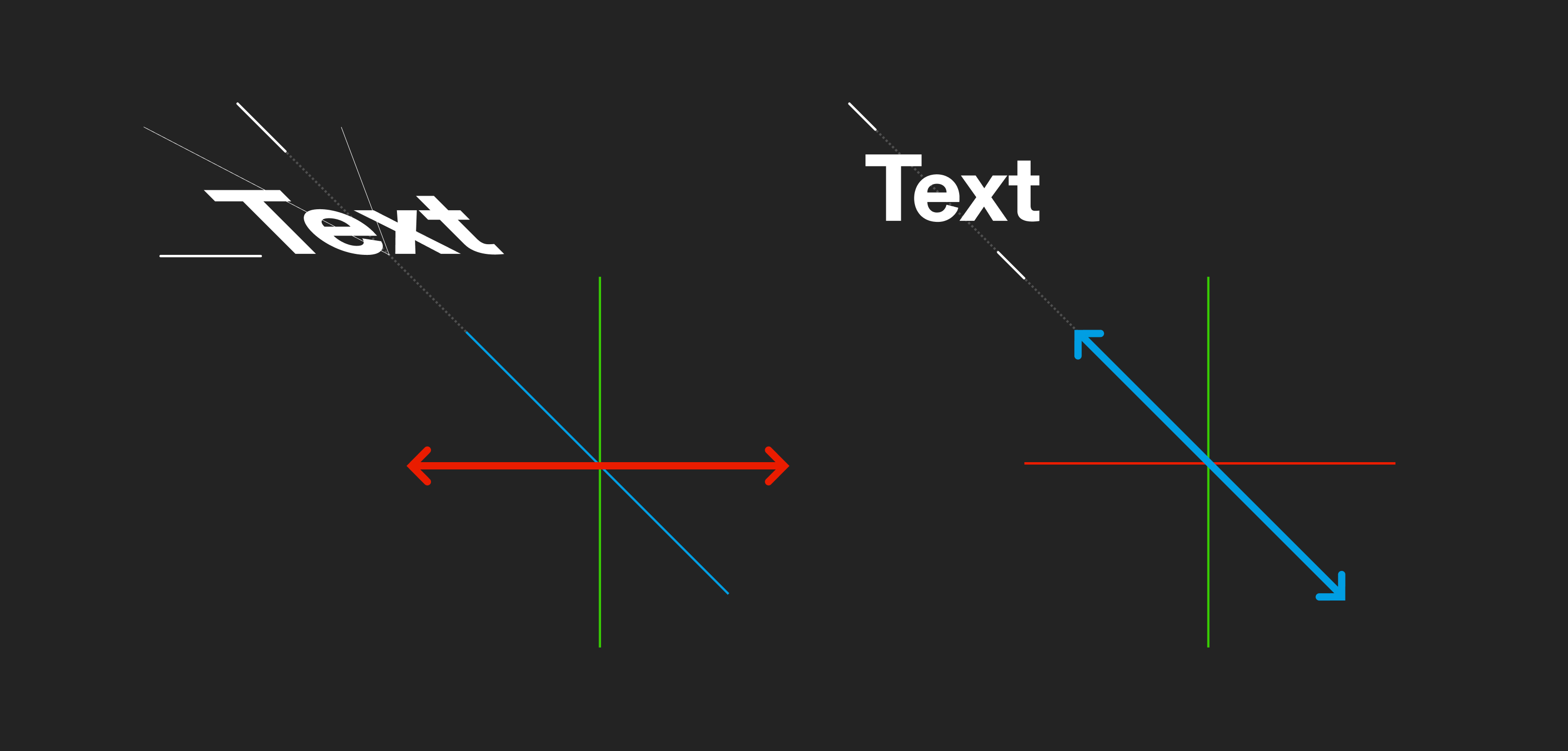
Vertical viewing angle → Height axis
AR viewing angle experiments.
Ambient Lighting → Font color / Optical grade axis
Ambient lighting experiments.
As a font moves through its designspace letterforms shift and reconfigure themselves within their bounding box.
Unless duplexed (intentionally designed so the size of the letter’s bounding boxes don’t change with the font style), each glyph can influence the space around it as the font’s style and axis change shape. This requires us to account for changes within our layout in new ways.
When we compensate for perspective distortion, we alter how text naturally behaves in favor of readability. These axes can be used to make type more legible by pulling the letterforms closer to how they’re read head-on, or in 2D.
Each approach collapses a different aspect of dimensionality.
Width and height axes can open up the compression of letterforms that normally happens when you move to a more extreme viewing angle. The squashed height of text set on a flat surface in front of you can be offset by increasing the height axis value. Likewise, the compressed width of text set on a vertical surface to the left or right of you can be offset by increasing the width axis value.
Slant axes re-adjust the orientation of the letterforms (the top parts of the glyphs to a greater degree).
Optical size axes can be used to accentuate or diminish certain aspects of a typeface to account for how far away it is.
It’s just as important to note what axes and elements these techniques don’t change:
Each 1:1 mapping of an axis to an input retains a different element of expected behavior for the font.
For example, if we set only the width axis to change, based exclusively on the viewer’s horizontal angle, the adapting axis has one degree of freedom. This means if you were to change your vertical altitude or distance while facing the font, you would still perceive the font normally with an expected sense of depth.
Similarly, a font using a slant axis exclusively mapped to a horizontal viewing angle would give you a true sense of depth, but mask its rotation and the direction of depth (3). These mappings make sense if UI or objects will travel on constrained paths, but in our real environments things rarely move in straight lines.
Context-based axes
Variable font axes and inputs can be mixed together to make type responsive with additional degrees of freedom. Multiple inputs can affect the same axis in different ways. One example involves combining a slant axis with a height axis to make things easier to read from both a horizontal angle and from overhead.
Another approach uses different axes depending on the orientation of the text. The slant axis adjusts when text is set flat on a surface while the width axis changes when set vertically like a sign:
We can see how the axis values change based on the typography’s orientation:
In this example, slant and width axis maximums are based on the angle of the text in relation to the reader. Entirely upright text doesn’t benefit from adjustments to slant. In the same way, text set on a flat plane benefits little from an increase in width (4).
From the original angle
These sets of approaches should only be applied to specific cases. As we increase the number of mappings that compensate for distortion, adaptive text becomes more like static typography set to always face the reader. Too many axis mappings give us diminishing returns. At a certain point it becomes more practical to just set a flat label in screen space.
Optically adapting type is beneficial when text needs to be directly on an object to act as a label, or within a UI element that may change perspective from interaction. The advantage is tied to retaining key aspects of perspective with readability.
Applications
As a concrete example we can look at how these techniques might improve interfaces like Apple’s measure app or Tilt Brush. We can keep in mind the two main cases for optically responsive type outlined earlier:
- The person moves around the typography anchored in worldspace
- Typography moves around the person, manipulated or by itself
Measure App
Spanning both of these categories, Apple’s Measure app is a candidate for slant based optical adjustments. As you set points for the ruler, the text displaying the measurement can move and rotate freely. After they’re set, they sit statically in worldspace. The text here remains in 2D, so there’s no perspective involved.
In Measure people may not be looking orthographically, or directly from one side, at an object. Because of this, typography may be set vertically or at an angle. Slant adjustments could be used to keep the text letterforms pointing upright keep things more scannable across a variety of positions and objects.
At at some point it may make sense for the font to just flip to something that reads horizontally with a perspective breakpoint (5). This is use-case dependent – these decisions are linked to how things are used.
Tilt Brush
Tilt Brush’s painting tool rotates around the artist’s hand, which provides a case for perspective adaptive typography. Both rotation of the controls for switching modes and the hand motions of the tracked controller contribute to perspective distortion of the present typography.
People naturally move their arm while creating things. Because the text is linked to the hand’s motion the perspective of the text frequently changes. An adaptive width axis on the font could be used to keep the text readable at sharper angles. Doing this would also provide people with visual feedback as the controller rotates.
The left hand UI could use optical perspective adjustments in a similar way with its large set of text labels.
Widening the “Info” text based on how much the controller is rotated would increase the rotational range at which the controller could be moved while the text remains readable.
If you extrapolate (6) the above case in a complex product like Tilt Brush it’s apparent how conflated reading and interaction become. Because of this, it’s important to weigh expected vs. learned behavior while making optical adjustments.
Both of these examples cover a very small subset of spatial scenarios with typography. While it’s easy to fixate on “scientific readability” or logic trees of edge cases, it’s more important to remember that in general, XR typography often finds itself at odd angles and in new places. The width, height, slant and optical adjustment approaches outlined here provide another tool for more robust reading experiences.
2D screen design puts forth its fair share of rigor – design systems, accessibility, attention to typographic detail, and responsive grid systems. Spatial typography, in its n-th wave nascency can aim for a similar bar as it evolves.
I’m always up for collaborating! DM me on Twitter or email me for collabs or contract work.
Footnotes
1. Optics, or how light interacts with the world around us is a crucial element of how we experience space. For the sake of focusing on typography and perspective it’s not covered it here. ↥
2. The Font Review Journal by Bethany Heck has one of the best (if not the best) current collection of examples explaining how idiosyncrasies in a type family imbue character and affect how it can be used. ↥
3. The slant axis is of note because it also changes the general ‘rotation’ of text as well as its height, albeit at an angle within the font’s bounding box. ↥
4. There are exceptions at the extremes of where something is viewed from. Vertically set text, if viewed from a high angle underneath or above it (imagine looking up directly at a billboard in NYC from the street) would benefit from a height axis. In the same way width may come into play if the reader reads the text from an extreme angle to the side. It’s very context dependent. ↥
5. Just like Responsive Web Design breakpoints (viewport max-width, etc.), spatial UI can adapt in predefined ways when it meets certain conditions. Note how the LEGO instructional example uses a rotational breakpoint to flip the text to the opposite side once someone’s view reaches an extreme enough point. ↥
6. There’s a long list of natural considerations tied to the scenario of adaptive type on the rotating controller. For example: human factors related to holding and rotating the controller, how far it should be rotated for other interactions, the relative importance of the “Info” text being persistent within the product, etc. ↥
Subscribe
Cultivating design communities across platforms.
Thoughts, updates and discoveries sent sparingly.