Typographic Emotions
Typography has a complex relationship with emotion. Emotion from any typographic experience is a complex system of the person’s prior cultural context, their environment, formal design principles and psychology. Designers navigate this through visual communication.
Generalizations: A disclaimer
There are no shortage of generalizations for how to use fonts. A common one is “san serifs for historical things and san serifs for technical uses”. Other stereotypes exist for typeface categories like the style of serifs and stroke contrast. Some examples of recognizable trends might be modern serifs for upscale fashion applications (circa 2010’s in the US) or wide Eurostyle related type for band albums and touring posters (circa late 2010’s in the US).
Additionally, the traditional classifications we use to refer to fonts themselves often don’t accurately encompass the range of fonts styles that can exist.
Naturally, both usage patterns and classifications are constantly in flux. Many designers choose to intentionally bend, subvert, and challenge typographic conventions.
Prior research
While visual communication is widely beholden to culture, some universal communication patterns exist. Phenomenon like the Bouba/kiki effect show that the majority of people associate particular shapes with sounds.
Application of these patterns has been demonstrated in work like Philippa Mothersill’s Emotive Modeler which provides designers with a tool to create informed 3D forms communicating specific emotions.
Charting a course
With that in mind, I wanted to try and measure how two primary components of a graphic composition – type and image (1) – might interact with each other and affect a viewer’s emotions.
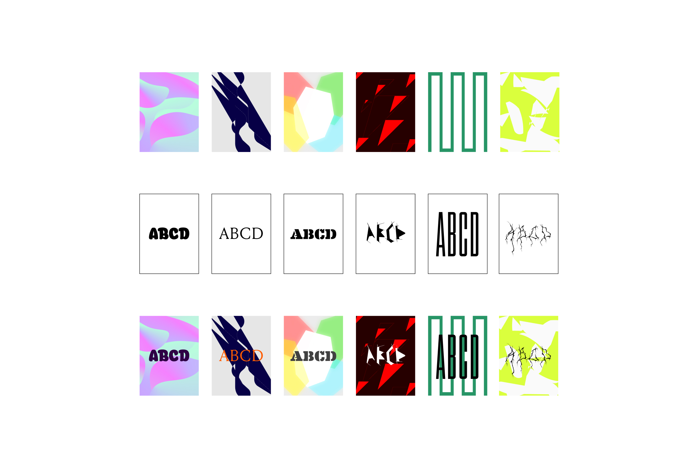
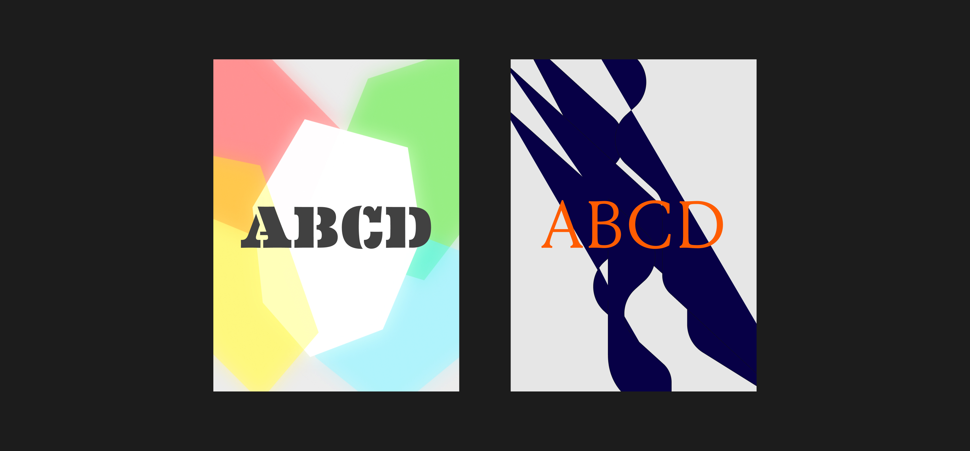
Because of the inherent non quantitative nature of emotion, it took a significant amount of trial, error and intuition to maximize what could be tested. Multiple approaches and feedback led to a more diverse spread of colors and emotions across the designs. At first, the typographic compositions had different text (reading things like “waiting”, “gift”, “loss”, etc.), but this added an additional variable that could prime people on emotion. I settled on the relatively neutral text string of “ABCD” (ABC may evoke ideas of early learning or the Latin alphabet).
To measure the effect of type and image, I aimed to design a set of three variations: type only, another with just the background image, and the original with both. This felt more manageable than trying to break down and isolate every visual property – things like color, scale, shape, etc. – individually.
The upper limit of the test was the number of total questions respondents could answer at one time. Because of this I settled for 6 different compositions, each with the 3 variations. The compositions were by no means “good” graphic design, but they served as way to start exploring the space.
Data collection
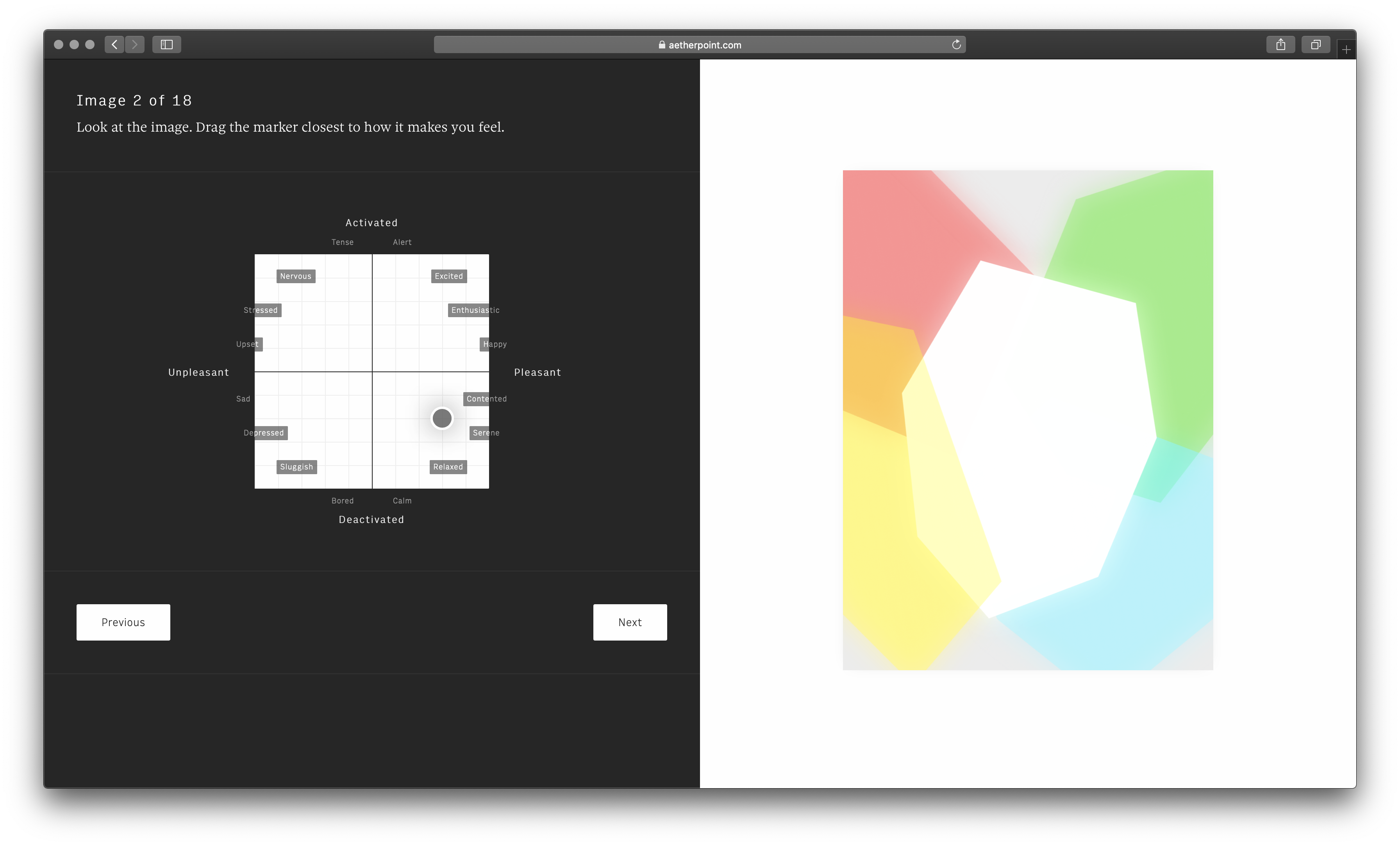
In order to collect data on feelings, I built a custom survey interface based off the Circumplex emotional model. Respondents could drag the marker to the set of emotions that most closely matched what they were feeling at the time.
The survey consisted of 19 questions. The initial question asked what people’s current emotion was. The remaining 18 questions presented people with a randomized set of the 18 test images.
I used Amazon Mechanical Turk to recruit participants, of which 125 provided valid responses. After respondents submitted their answers, the site would post data to a Google Docs spreadsheet. From there, I used Python and JupyterLab to explore and manipulate the data.
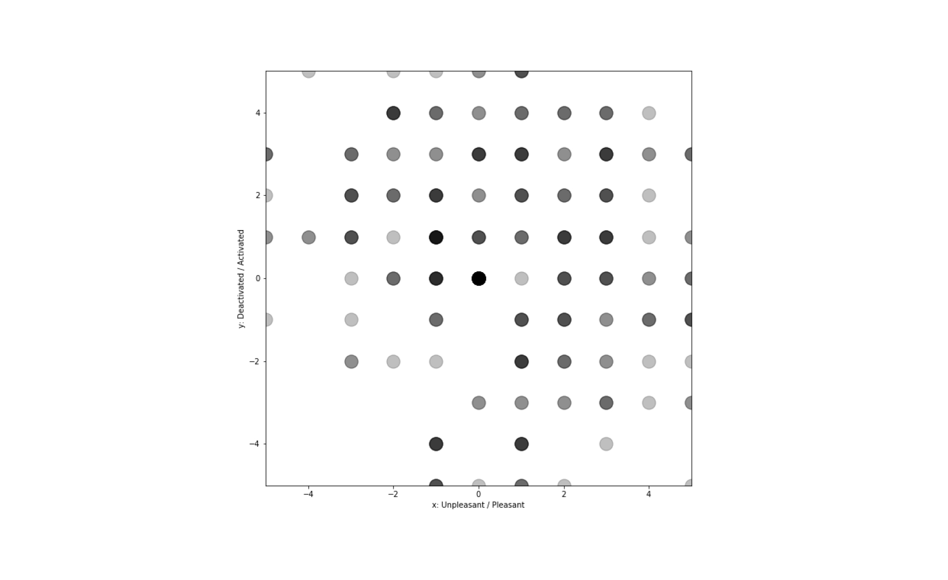
Being incentivized to complete tasks quickly, turk respondents were less likely to respond with honest answers. Most images had a high standard deviation of 2 - 3.
After learning this, I reran the experiment with friends (15 total respondents) from Twitter (which could have introduced a different type of bias through a pool of more design oriented people) and got more consistent results (standard deviations generally within 1 - 2).
Most people reported that the images made them feel either positive and activated, positive and deactivated or negative and activated. Few responses landed in the negative and deactivated region.
Part of this could have been due to acquiescent bias, or the tendency to want to answer amicably. Images that evoked sad emotions may have also been less natural to design.
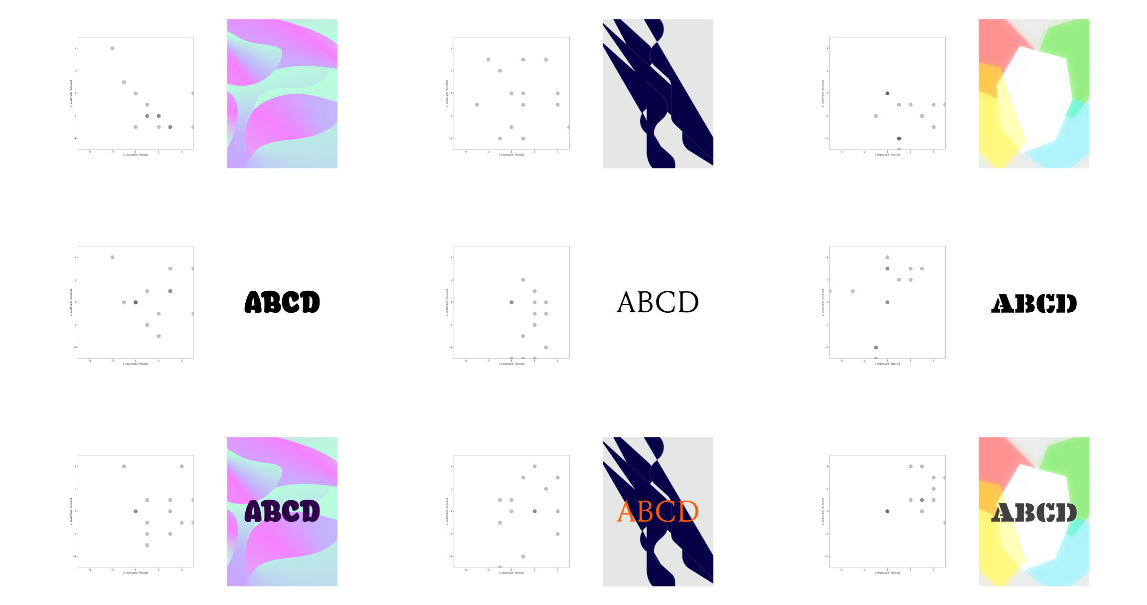
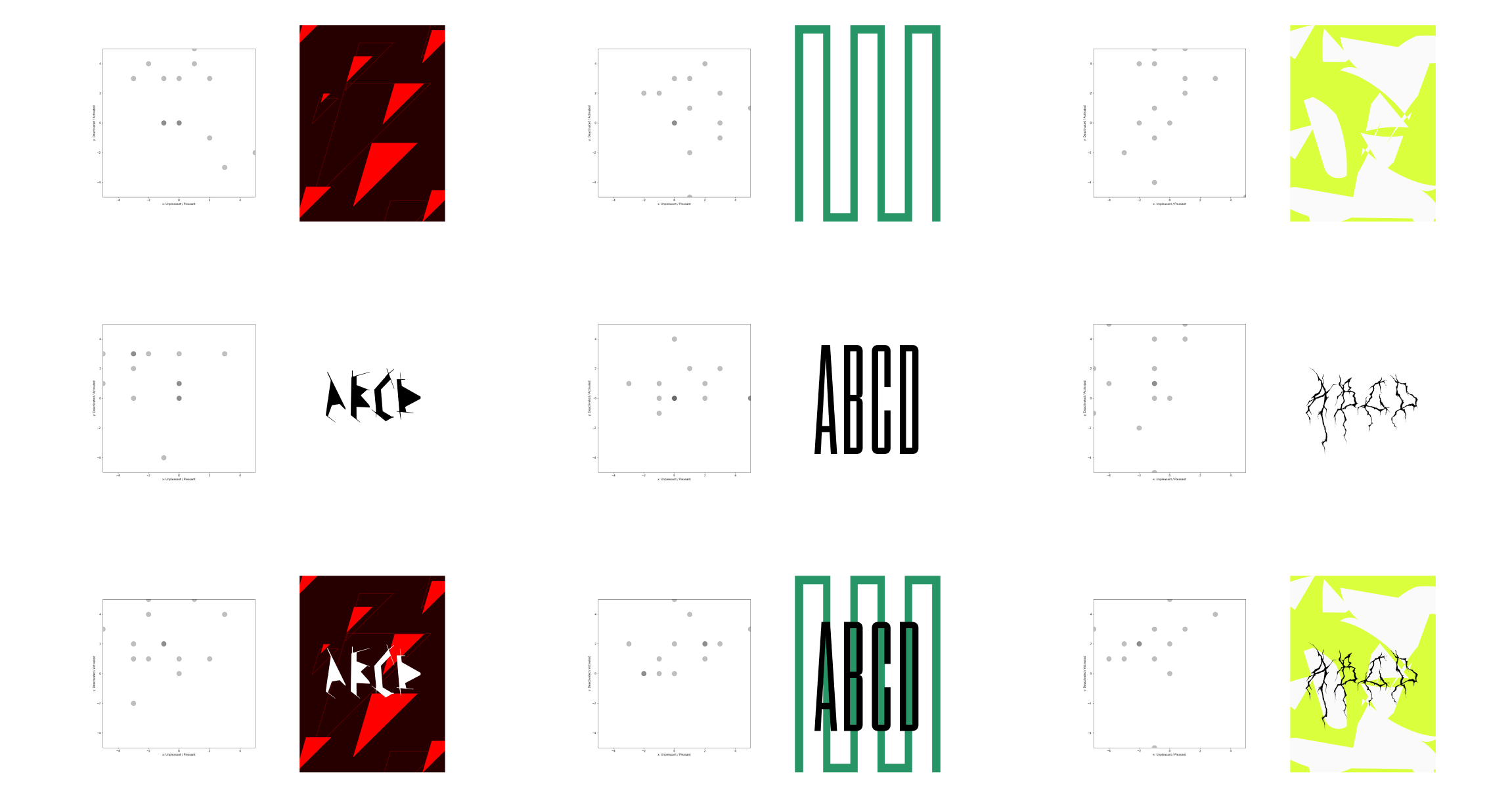
It was apparent that the combination of typography and image imparted a wide range of effects on elicited emotions. After calculating the mean of each image response, the relationships could be visualized as a series of vectors:
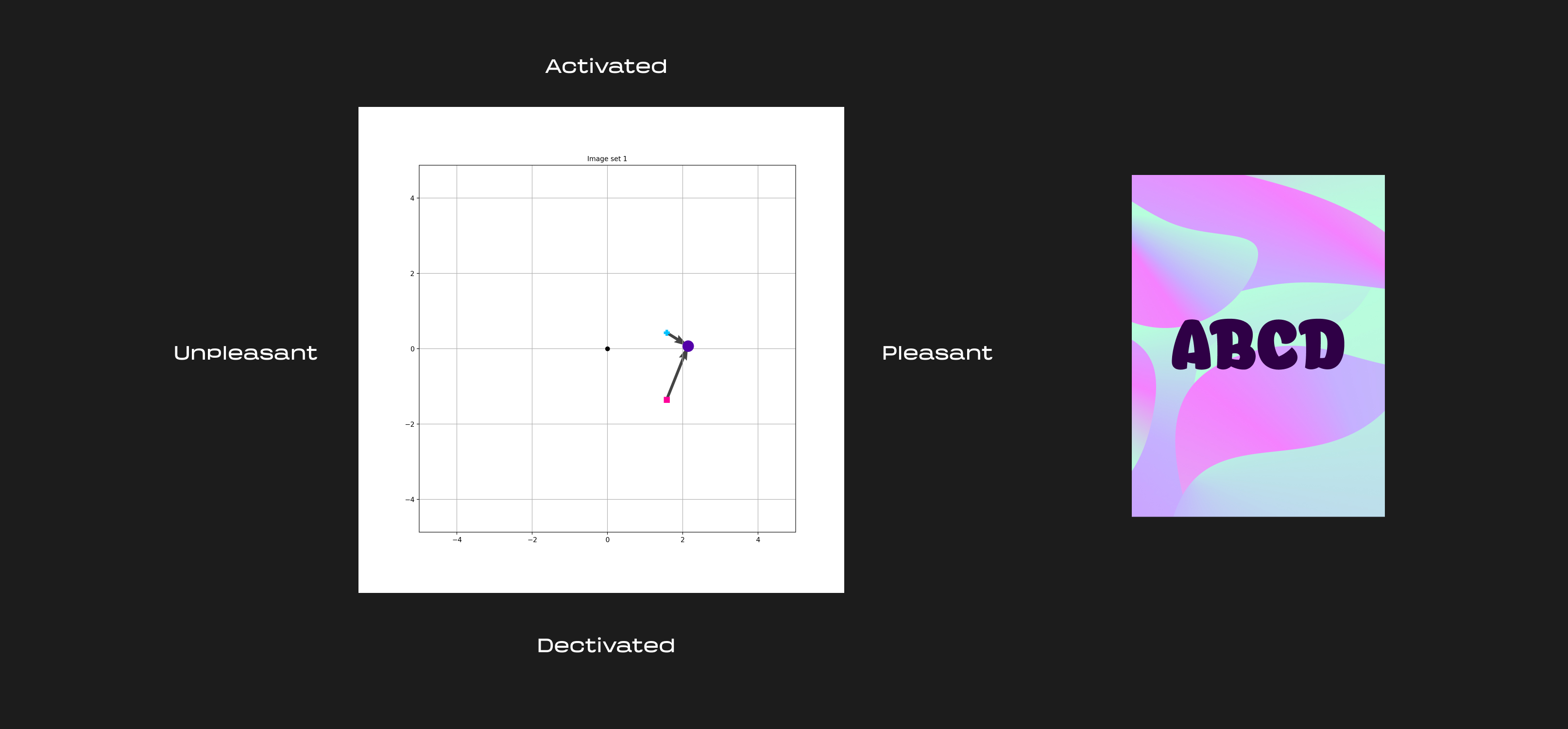
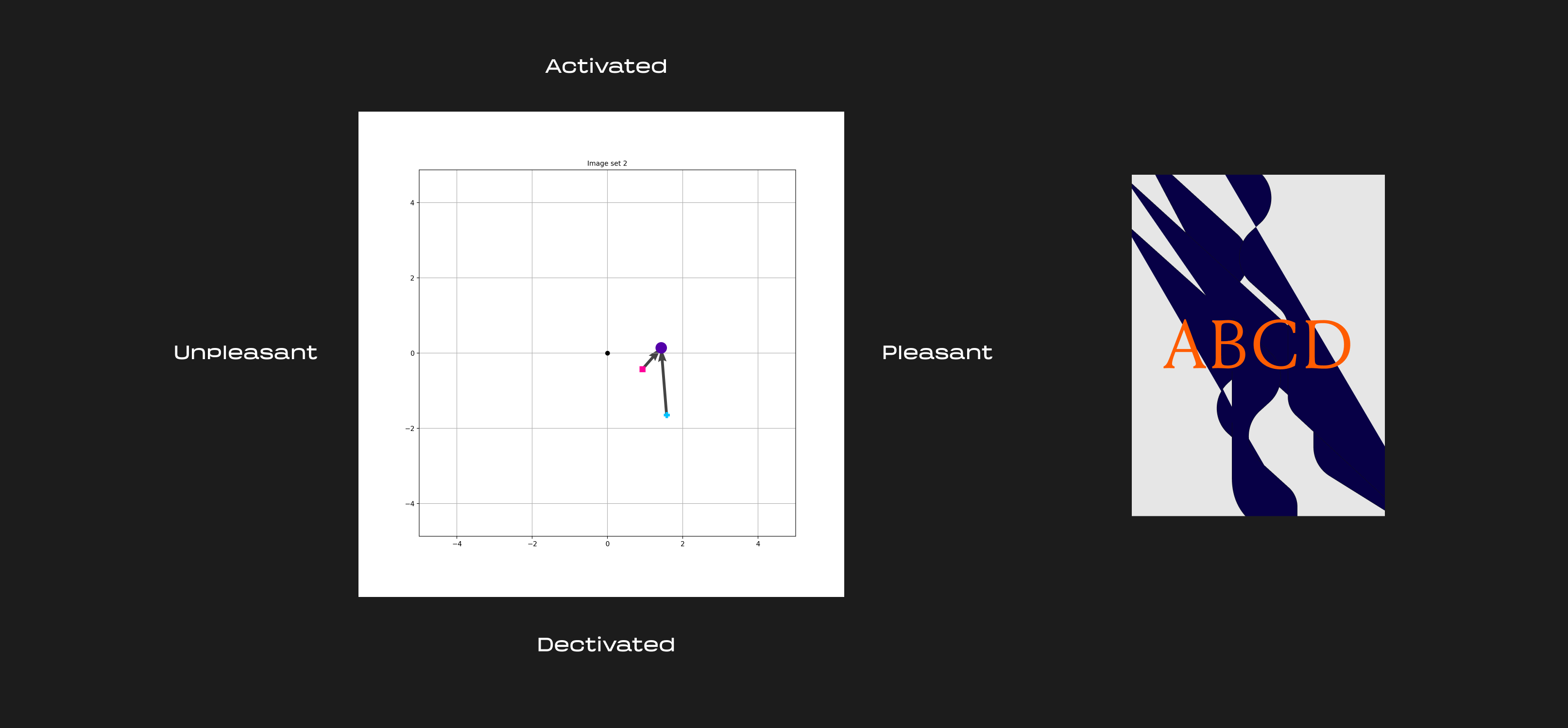
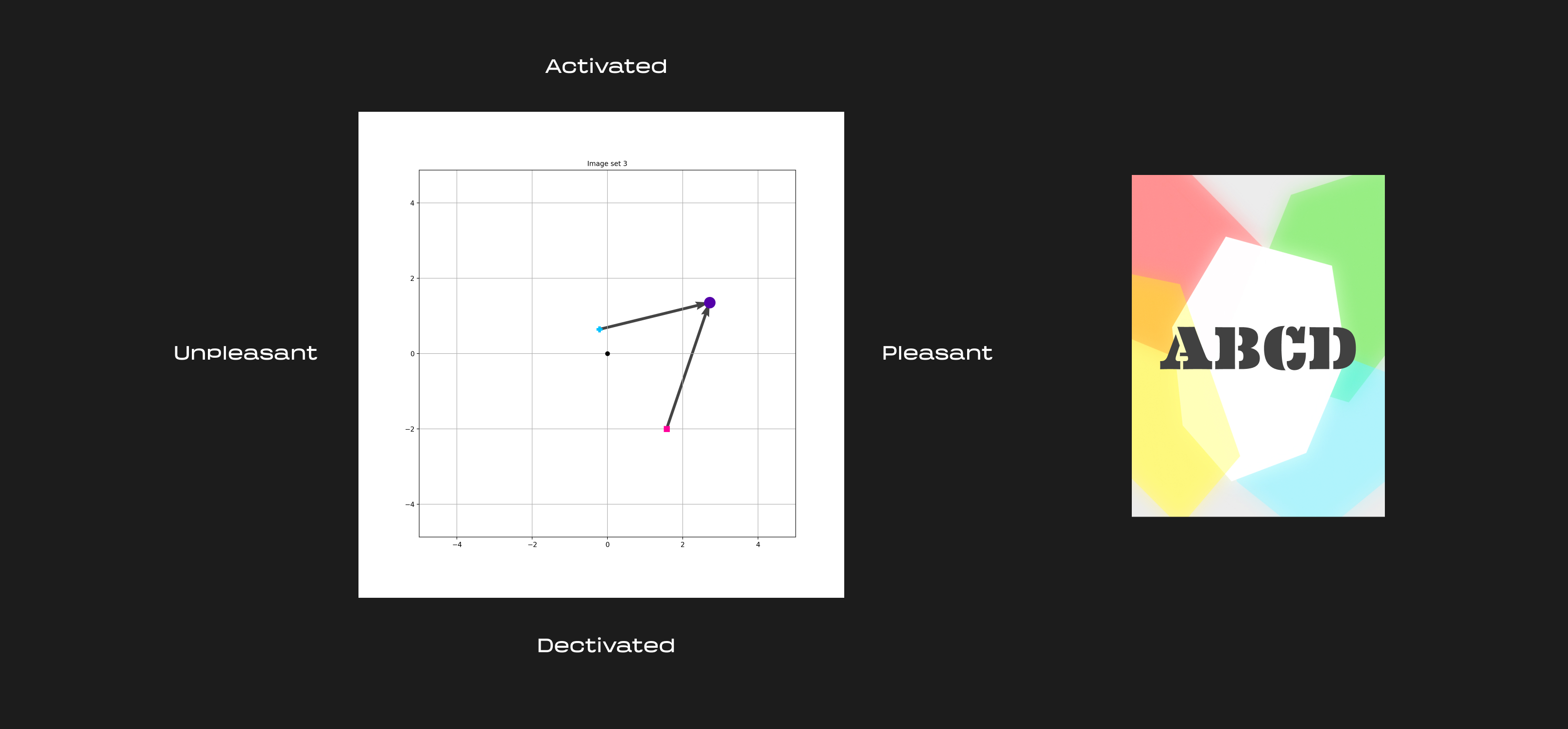
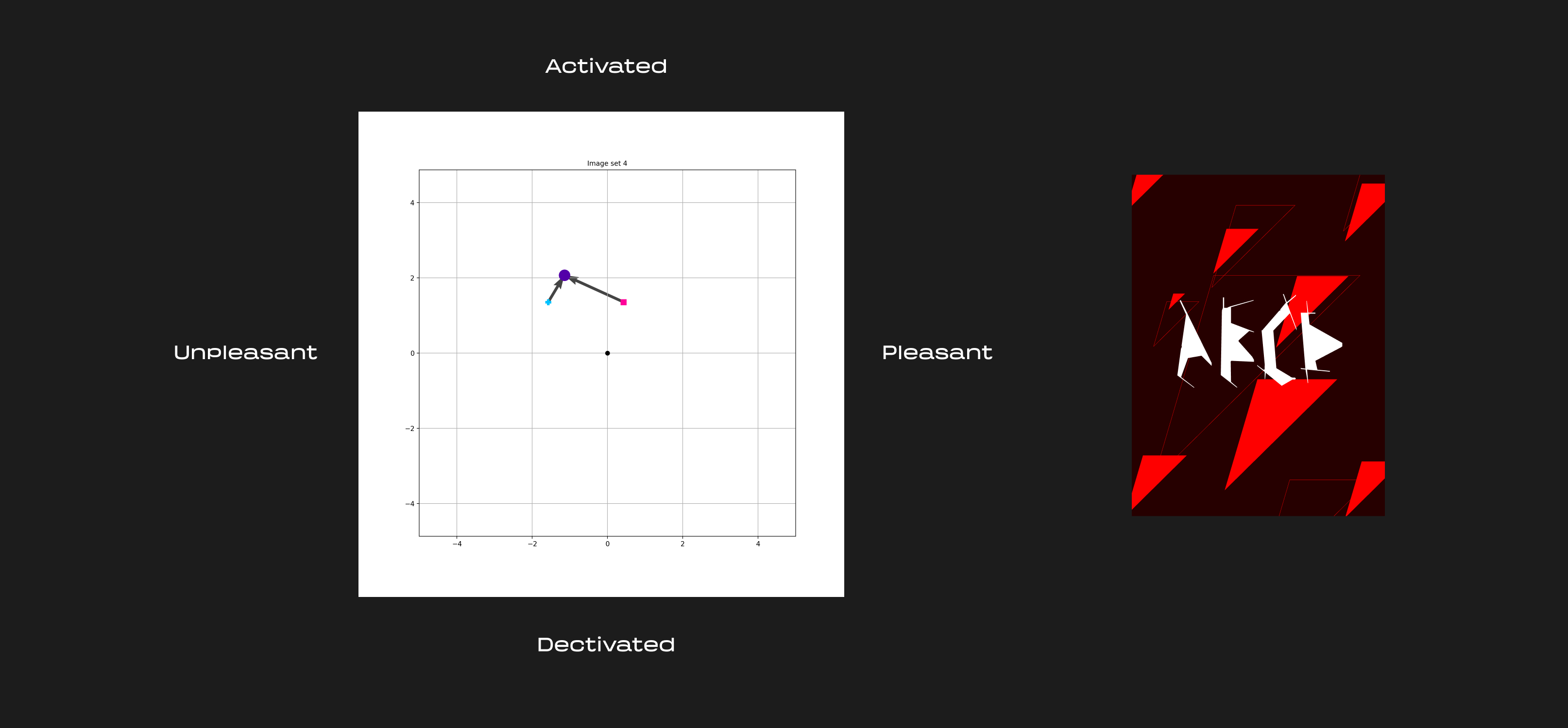

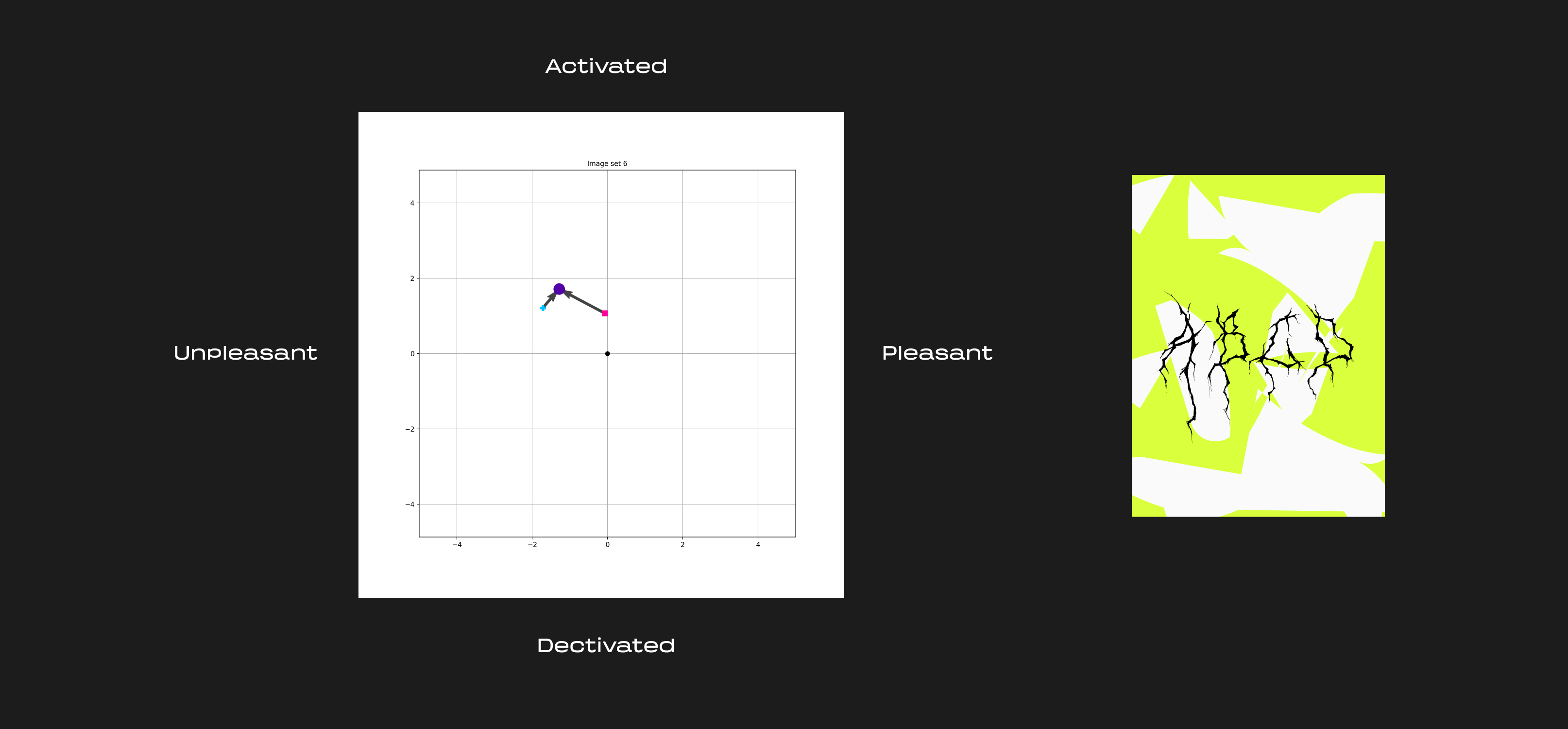
In a linear, non complex world, we would expect the combined images to be a simple sum (or perhaps averaging) of the text and background images, but we can see this was not the case.
Instead, compositions often exhibit bidirectional interaction between the text and background, where both elements end up influencing each other. Oftentimes combined images are reported as more positive/activated than either the source text / background image alone. Barring the first set, all the combined images resulted in higher reported activation. This was likely because the inclusion of text generally adds visual contrast and complexity. It becomes particularly visible in cases like the combined second and third image sets which end up having a high color contrast.
Generally, the addition of both type and image can have varying levels of impact on reported emotion. The study doesn’t reveal a cipher for evoking emotion, but it does point to how beautifully complex things are.
Further exploration
- We could consider how starting emotions affect people’s responses.
- It would be interesting to see how much effect words have on reported emotion.
- More complete data would include a report for every background matched with every other typography combination.
- The images here were abstract and avoided cultural references, which likely elicit the strongest emotional responses, it would be interesting to try relevant, applied graphic design in the same test.
- Another approach would be to isolate the variable of color and rerun the same experiment.
Thanks to Judith Amores for the direction and guidance.
I’m always up for collaborating! DM me on Twitter or email me for collaborations or contract work.
Footnotes
1. It’s worth noting these often aren’t so separate from each other in design, but for the sake of testing things I separated them. ↥
Subscribe
Cultivating design communities across platforms.
Thoughts, updates and discoveries sent sparingly.