Vox Media Article System
How might we help people better traverse and experience things across Vox Media’s widely diverse brands and active communities?
- Client: Vox Media
- Timeline: 3 Months
- Team: Self Directed → Audience team (5 people)
- Role: Designer
Context: Vox Media’s Networks
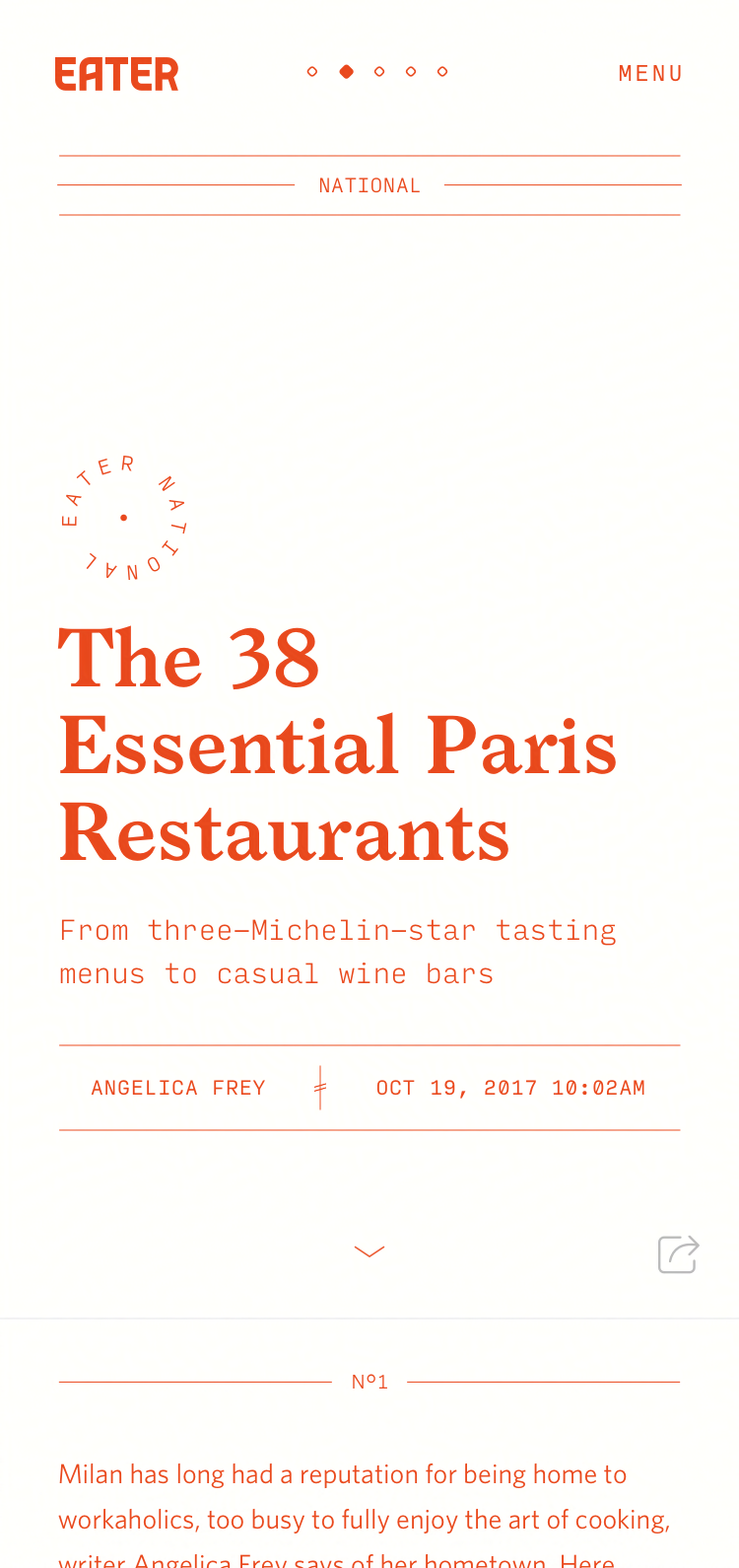
Vox Media holds a number of high profile editorial brands, each with their own editorial strategy. These include The Verge (Tech), Vox (Politics), Eater (Food and Restarants), Curbed (Real-estate and architecture), Racked (Fashion and Shopping), Recode (Tech and Business) and Polygon (Video Games).
Goal
Our goal was to increase mobile exploration by better supporting people’s curiosity while respecting their limited amount of attention.
The article system started as a hack week project around article interactions and hybrid video/audio/text views.
These designs served as a basis of conversation – both within our product team and to individual editorial stakeholders (Senior and Executive Editors).
Strategy and Process
We approached the problem from an information architecture and interaction / visual design angle at the same time. This allowed wireframes and Vox Media’s diverse brand language to inform each other, which was key for making sure any design systems worked cross brand.
Knowing articles were generally people’s first destination for we aimed to give them as context as possible as to where they were in relation to other types of content.
Jared Fanning, another designer I was pairing with, focused on formalizing our model for thinking about it. From the center article, it started by surfacing stories of immediate relevancy. These would be within the closest proximity to the user, interaction wise. Moving outward, more general categories and tags suggestions would be at the next level, followed by site wide topic sections and groups.
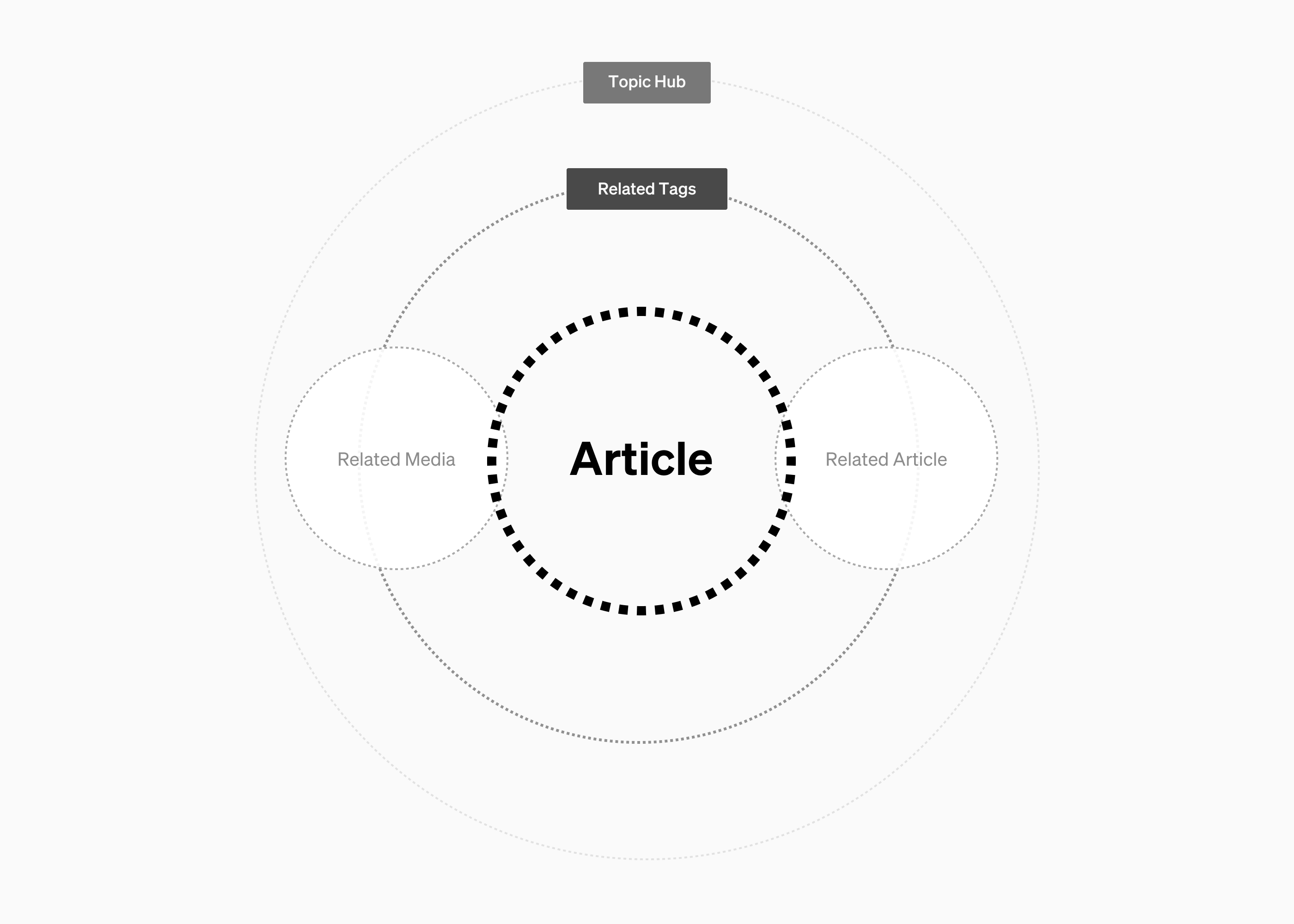
Using this framework, we designed prototypes to surface stories and suggestions in this order. We explored a number of options – sections to the left could pull from any level.
From there we started moving towards prototypes.
At this stage it became apparent that the tagging system was largely incompatible with how people looked for things that interested them. In hindsight it would have been better to delve into deeper design research to better understand how people normally explored things related to the story.
Prototyping
Knowing the tag approach was too rigid, we made adjustments to our structure to allow people to move laterally between videos (a company wide push) and a recent feed of stories. The primary design challenge here was giving people freedom without becoming distracting to the primary reading experience.
Some of these attempts were overly complex:
Because users could sidestep over to one of the side panels at any scroll point, it was important to make sure that people knew where they were at all times (the side panels could also scroll independently). To solve for this, I designed a micro interaction that shifted the text into view to give people context where it would otherwise be offscreen.
Afterwords, we realized that the side drawer pattern ended up being too constrictive. While they provided immediate access to other stories, some of these items would be noise and better accessed from their own dedicated view.
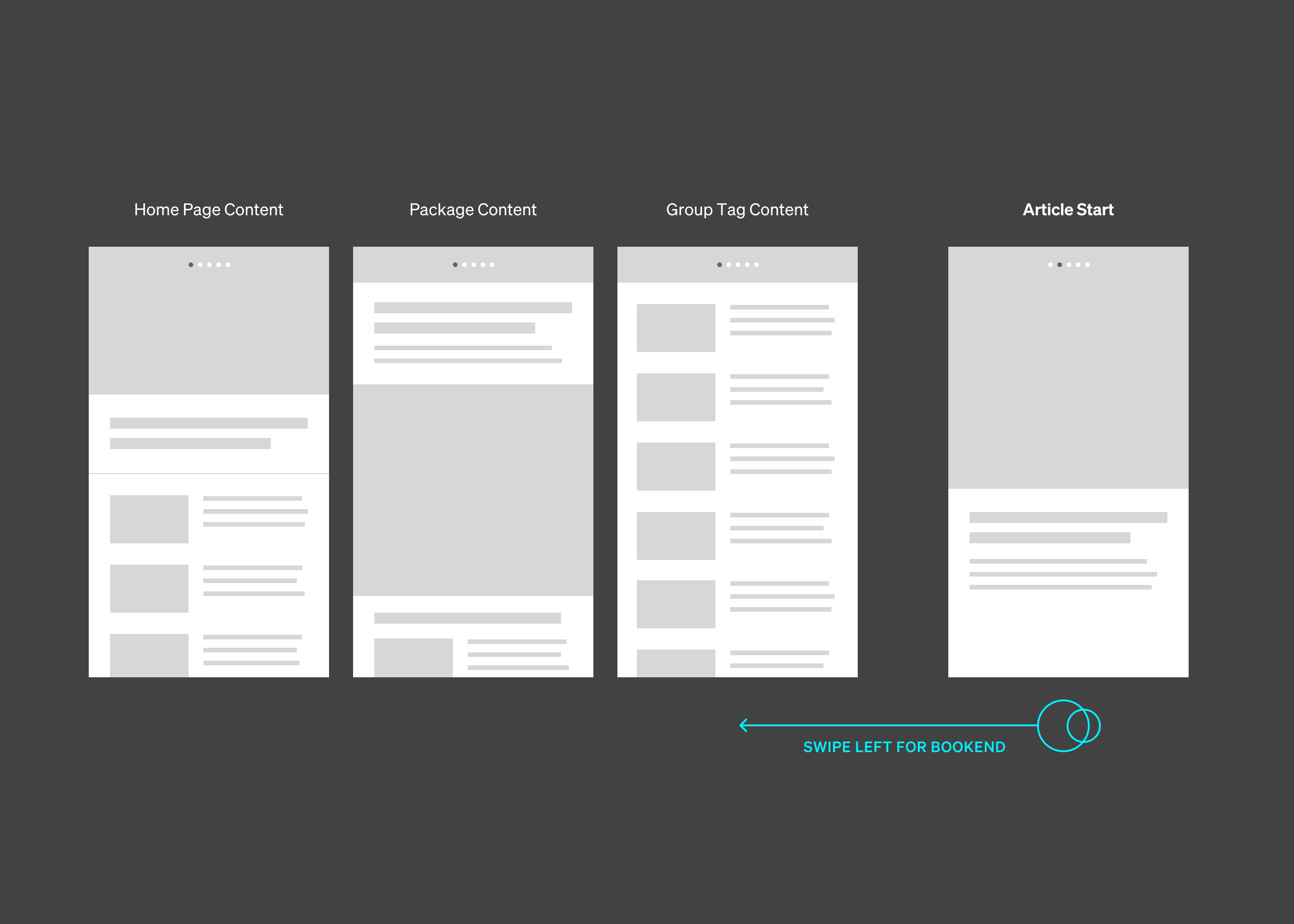
From that point, we ended up moving onto a hybrid approach with story to story swiping and an end panel providing wider story suggestions. This became the framework we designed things with.
Cross Brand Typography and Visual Design
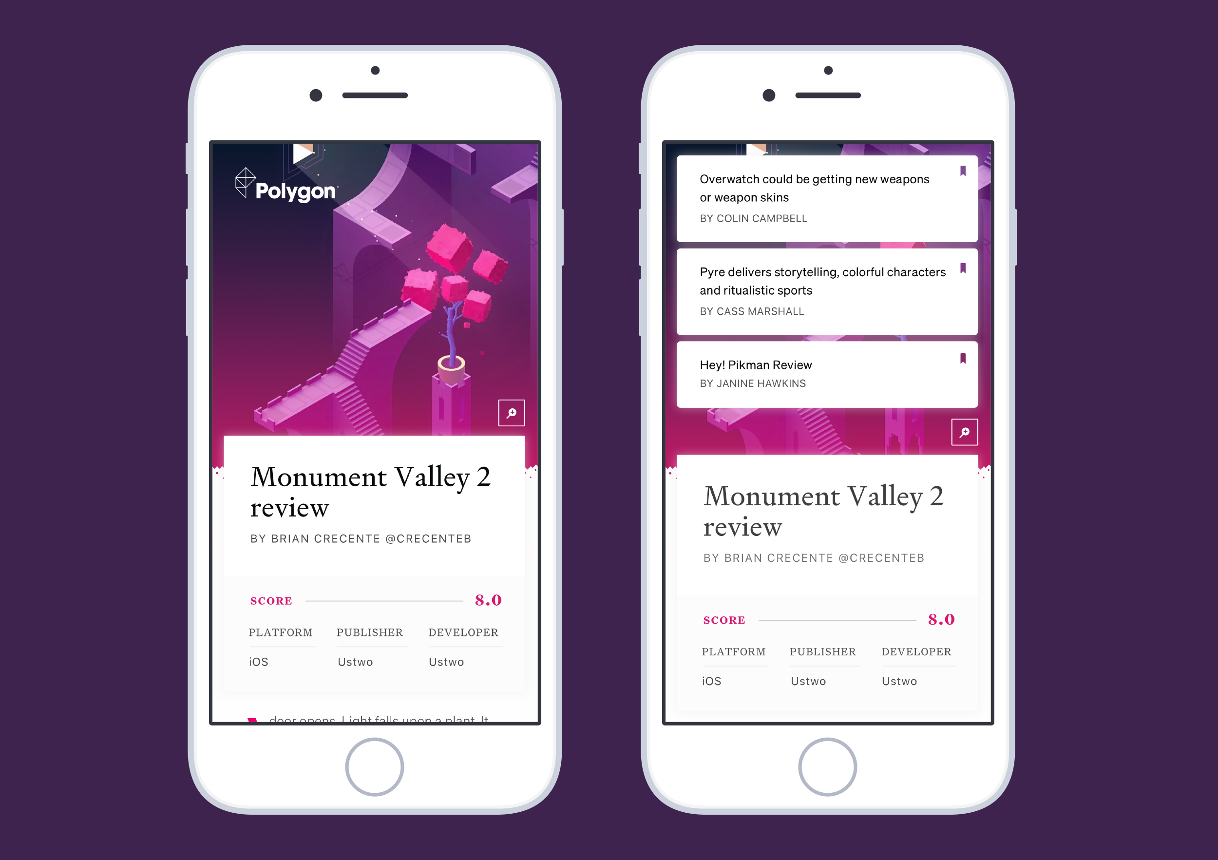
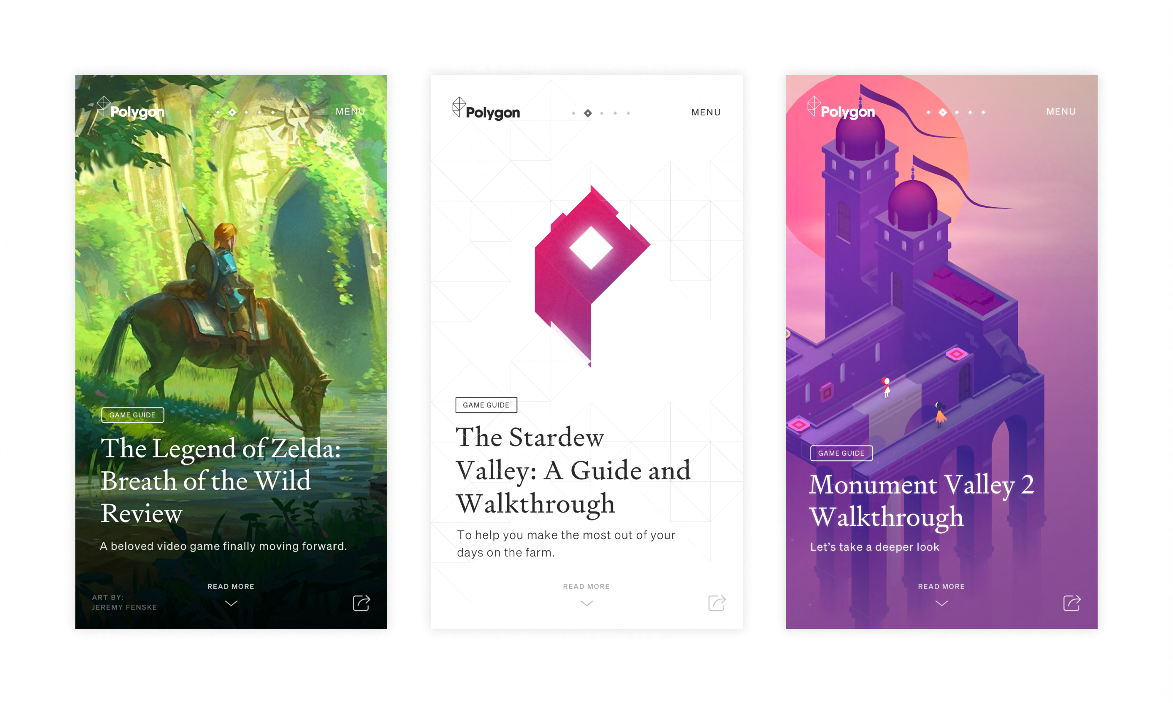
By working on visual design parallel to information architecture, we found story art would be widely varied across brands – some brands housed beautiful editorial artwork and visuals while others lacked it. After grouping each brand’s needs into architypes, we designed a series of views using new sets of typefaces and visuals that best projected their brand and media preferences (video, text only, .etc).
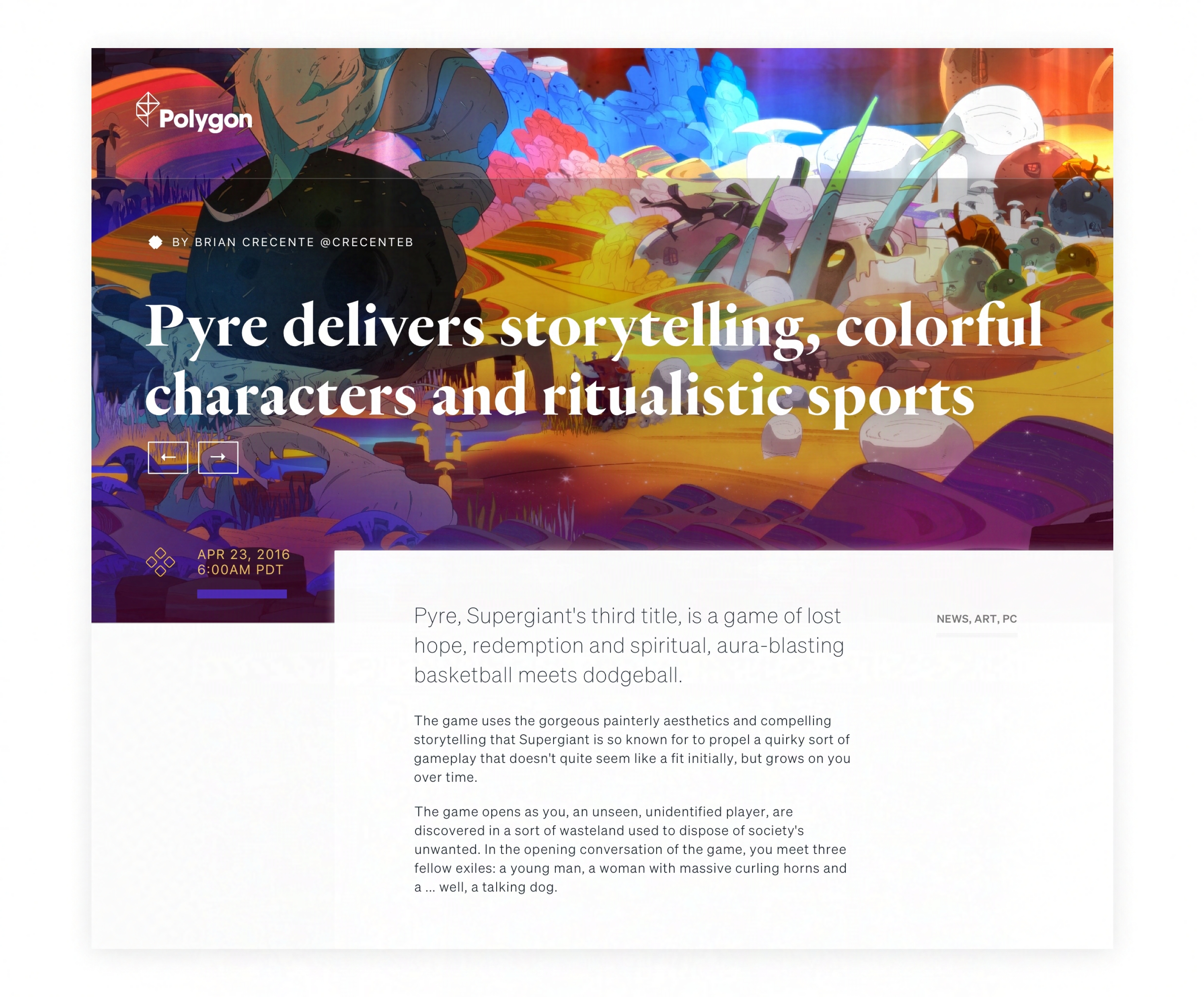
For Polygon – a video game site, I chose to explore UI panels that emitted light (inspired by thatgamecompany) instead of casting shadows like material design. Polygon had a wide range of beautiful imagery to showcase and we designed it accordingly. We also explored the creation of visuals within a game engine itself. Typeface selection aimed to add lightness relatability.
For the Verge, we looked into futuristic neon aesthetics and both the beauty of technology as well as its imperfections through natural glitches.
By exploring brands separately but drawing from the same established framework, we could push stories further and spend time working out key details.
From there, we shifted to streamlining the overarching design system and codebase.