Medium App Design
How might we cultivate relationship building between consumers and creators on Medium?
- Timeline: ~4 Months
- Goals: Facilitate meaningful relationships in Medium’s ecosystem. Realign retention.
- Team: Multiple small product teams
- Role: Product Designer, Design Prototyper – one of three designers.
- Areas of focus: Concepting for home, Group navigation, Alerts tab and You tab
Connections over Feeds
Medium’s goal is to help people read and write about things they care about. We launched a new app to bring readers closer to their interests and authors closer to their audience. Ev Williams writes about this space incredibly eloquently, which I would recommend for those more curious than my two paragraphs below.
Recommendations (reels, streams, feeds, etc.) have the drawback of being opaque for people. It is hard for people to know why they are seeing a particular piece of content. Furthermore, giving feedback to the system is vague. It all too often takes the form of something like: “show me more/less of this” or silently factoring in behavior and content engagement. This doesn’t foster the level of connection readers and writers (which vary from independent writers to full blown publishers) want to have on Medium.
Furthermore, recommendations create warped incentive structures for creators. Creators are primarily motivated to create quantity (publishing at a synthesized cadence rather than when they have something important to say) over quality. Feeds incentivise tap-grabbing headlines instead of new thoughts. Quality itself is also influenced by “magic” metrics determined by the algorithm over humans from particular audiences.
It took a whole team of people – designers, engineers, product managers and leadership – working together to forge a new app from a set of hypotheses. Special thanks to the other designers on the team who I got to work closely with day to day — Raymon and Herzog who focused on the home tab/reading view/architecture and prototyping respectively – driving the app forward to production.
Follow Centric
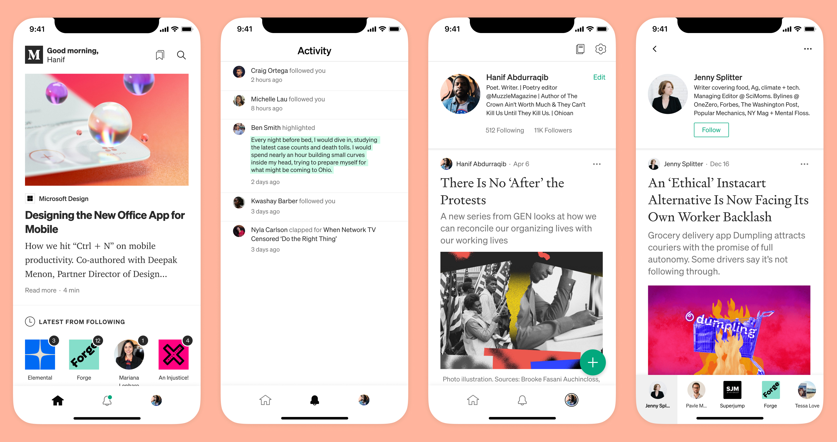
To better connect readers and creators, we landed on a model centered around following. This way, readers have agency over what they see and writers have a good sense of their audience.
My focus shifted from the design of the Home tab to the Profile, Activity and You tab views of the app.
Core profile
We wanted to give people control of how they presented themselves within the Medium ecosystem. To do this, we used the profile view to house both the creator’s bio and content inline – both of which could be customized and styled.
A number of considerations needed to be balanced:
- Expressiveness – What people can customize
- Primary tab bar – How people could move between the main sections of the app
- Group traversal – Traversal within groups of profiles
- Stories – The balance of story preview content and functionality for that story
1. Profile Expressiveness
Initially, I explored potential ways people could express their brand through profile pages. This led to a decision to invest additional time in profile customization.
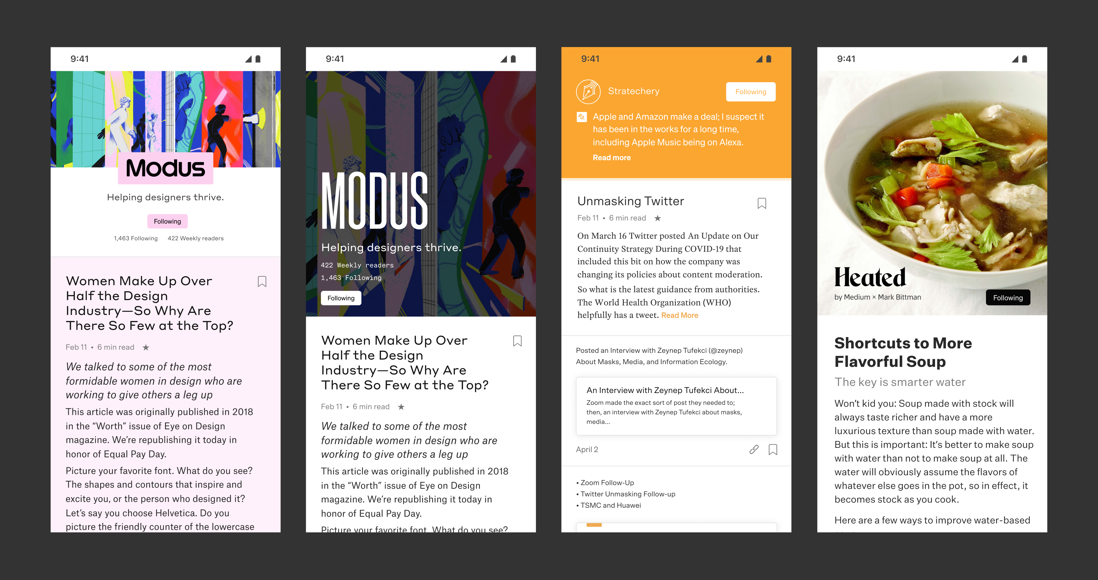
Within the app, we wanted to provide the most expressive style options that would still scale across Medium.
Profiles could be customized with multiple layouts, logos, text, theming, background images and colors – all of which would need to work for dark and light OS modes. We also had a particular set of colors that could be specified (or not) by creators. Tables like the one below helped us devise and decide on a system that balanced branding, consistency and accessibility across best and worst cases.
I advocated for a backdrop, which flips on for profiles with images to ensure sufficient contrast.
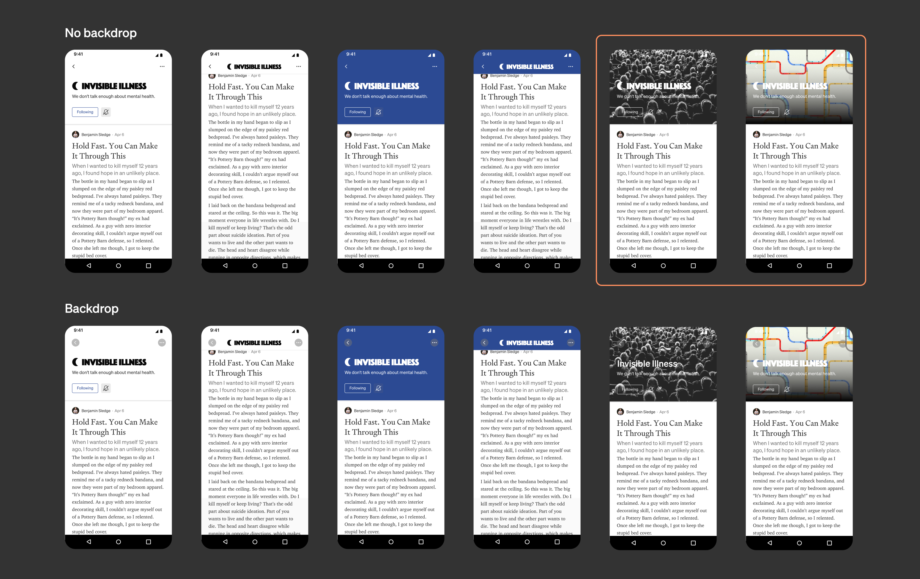
For profiles with background colors or no explicit styling, we could ensure through an algorithm there would be sufficient contrast for the “<” and “...” buttons. This was true for both the scrolled and unscrolled states. We finessed the transitions, working closely with engineering to make sure moving between different views felt smooth in every case.
2. Primary tab bar
After prototyping multiple options, the team opted to hide the primary tab bar to prevent it from competing with both the group nav and general reading experience within the profile.
3. Group traversal
Considered along with the primary tab bar were ways to quickly move between profiles within a group. Groups could contain things like “Latest from Following”, “Your Daily Read”, “From Your Reading List” and “Who to Follow” as well authors writing about specific topics. The order of the group profiles were mirrored to their ordering within the home tab carousel.
Each approach we tried had tradeoffs around efficiency (to both the next item as well as profiles several slots down) and clarity. The value of showing the group name and individual profiles ranged as well – it often depended on the goal of the group itself.
We opted to continue with a variant of the drawer approach (far right above) because it encouraged people to jump to the next profile, enabled random access, and kept creators front and center through the branded icons.
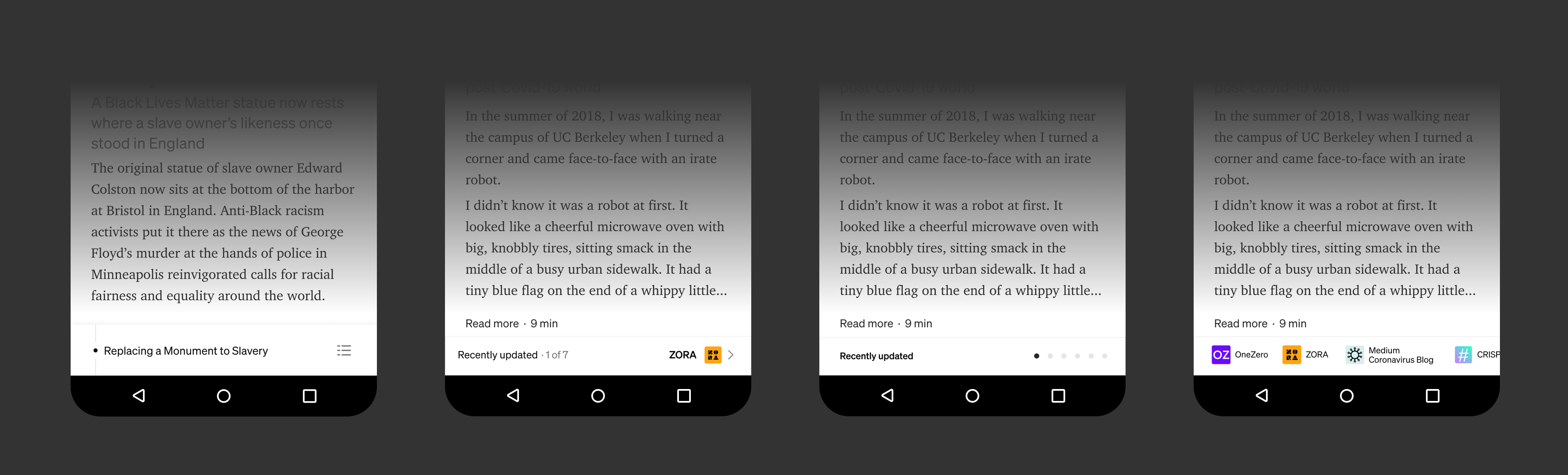
4. Profile Stories
To make a consistent scrolling experience, we truncated the heights of the content, allowing them to be expanded while still showing an informative amount of the content in the preview. Unlike video or image driven content, Medium stories occupy a wide spectrum of heights. Stories can be anything from short form written content, image based comics to lengthy stories. User research and prototyping quickly revealed it was too easy for people to lose their place when quickly scrolling between stories if they had a widely variable height.
Managing your own Profile
Understanding the direction user facing profiles were heading informed our approach for personal profiles. Because the layouts of profiles could be set in a variety of arrangements, we intentionally created a separation between people’s profiles and controls.
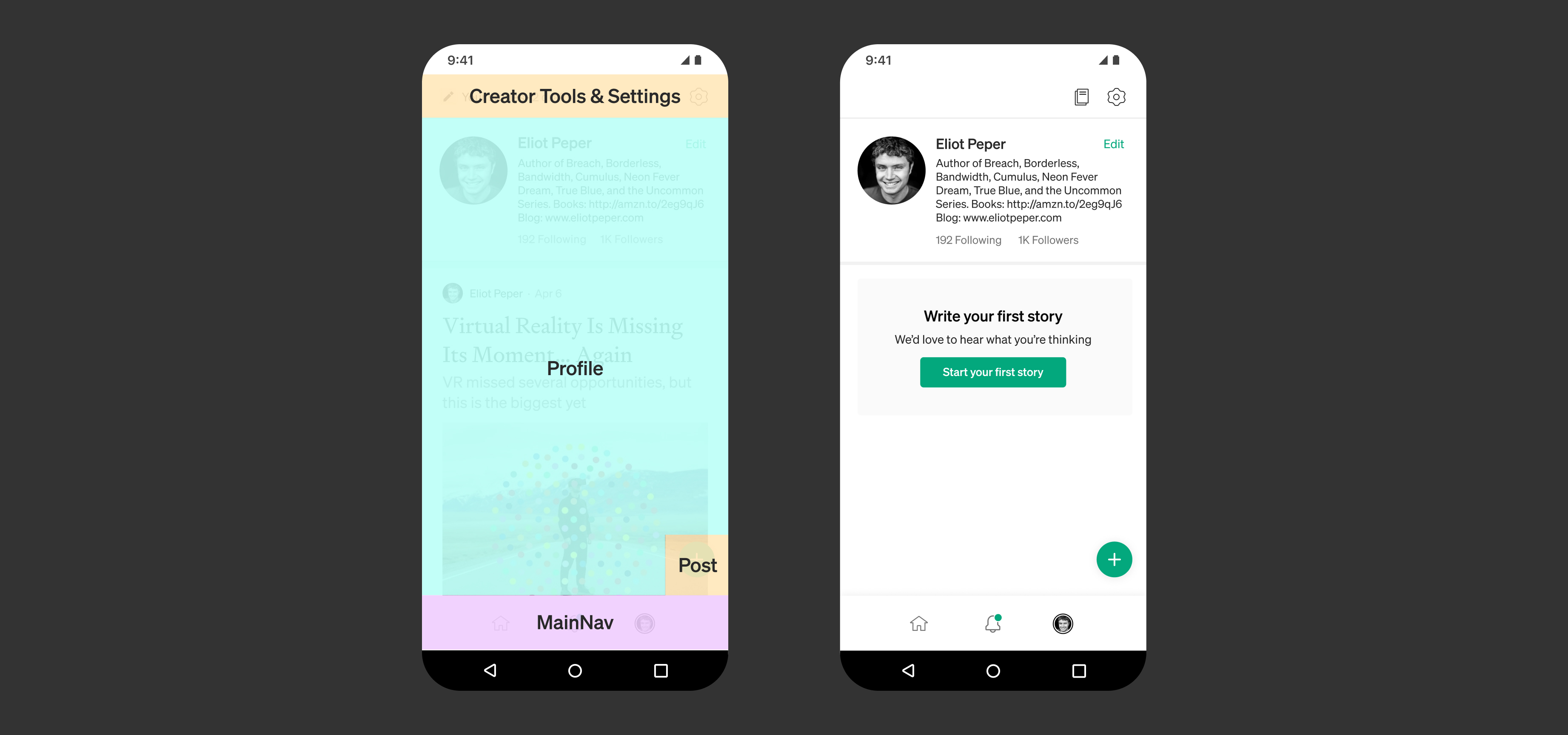
This way, edit profile controls would stay in a consistent location irrespective of layout, and we could maintain a clear level of parity between the You tab and the way other people see the same profile.
We tried several UI patterns on the way to finding something economical and clear to people.
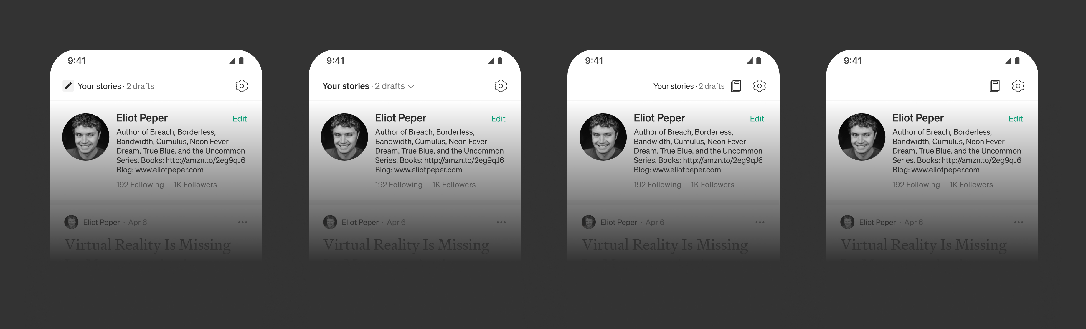
We opted for the last version which was the most simple to test and extensible if we ran into any usability issues.
Home feedback loop
Leaning on learnings from previous initiatives with home view modules (that Herzog and I prototyped designs for), we aimed to build a clear feedback loop around follows. Following something immediately adds it to your home view.
One of the challenging aspects was balancing the recommendations driven vs. follow driven modules on the home view. Leaning too heavily on stories from followed creators would result in too narrow a window with which to discover content. Falling back too heavily on traditional feed driven approaches could make it too hard for people to have agency over what they saw. Raymon architected a revision to this approach that we shipped.
We brought over sections that supported the core idea of following, giving recommendations to new creators and publications and tying publications and author information to story previews.
Other modules that had proven to be valuable previously like Your Daily Reads and Reading List ended up providing ways to surface fresh, completable content.
New Feedback Loops
We shifted Medium’s approach away from feeds and created systems that nurtured personal connections between readers and creators. Writers were immediately appreciative.
Download the Medium app here.
Other things accomplished at Medium
- Co-concepted and prototyped an early idea, shipping as the Your Daily Read home module, increasing retention by 3.55% on Android
- Shipped new features across web and mobile: Mute, Save to Medium and Reading List V2
- Concepted new reader/author feedback systems
- Assessed and selected Medium’s base typeface, Söhne.